Page History
0
| Table of Contents | ||||||
|---|---|---|---|---|---|---|
|
The XY plot Plot can be used to display the effect of two categorical variables, like time and treatment or dose and treatment, on a response variable. Only one probe(set)/gene may be visualized at a time.
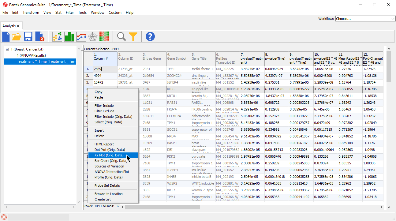
Invoking from a gene list
We will invoke an XY plot Plot from a gene list child spreadsheet with genes on rows. The parent spreadsheet should include the categorical variables you want to chart.
...
| Numbered figure captions | ||||
|---|---|---|---|---|
| ||||
|
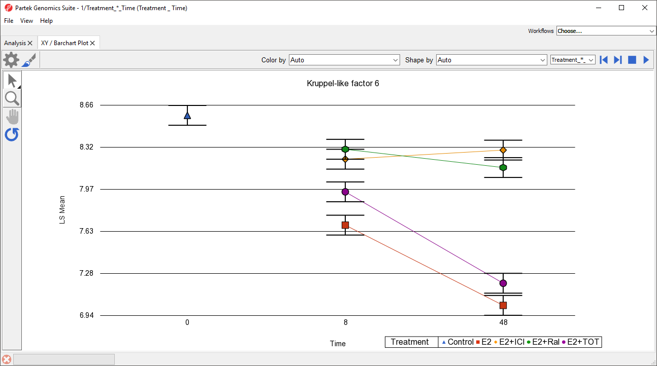
An XY plot Plot will be displayed in a new tab (Figure 2).
...
The plot now shows time on the x-axis, plots treatments, and connects treatments across time points with lines (Figure 3). Each point is the LS mean value of all samples with the same values for the two selected categorical variables. The error bars are standard error.
| Numbered figure captions | ||||
|---|---|---|---|---|
| ||||
|
...
Lines, but not points, can be selected when using Selection Mode (![]() ).
).
Invoking from the parent spreadsheet
It is also possible to invoke an XY plot from the parent spreadsheet using the main toolbar.
...
To switch this plot from to one of the gene lists we have created, we can use the drop-down menu next to the previous/next controls.
Bar Chart Plots
The XY Plot can instead be displayed as a bar chart with overlayed bars, vertically stacked bars, or horizontally stacked bars. A bar chart can be directly invoked or an XY Plot can be converted into a bar chart (and vice versa).
...
Overview
Content Tools