...
Each dot of the plot is a single sample and represents the average methylation status across all CpG loci. The two Naive shNANOG LCLs samples do not cluster together, but we will not exclude them for this tutorial.
...
| Numbered figure captions |
|---|
| SubtitleText | Principal components analysis (PCA) showing methylation profiles of the study samples. Each sample is represented by a dot, the axes are first three PCs, the number in parenthesis indicate the fraction of variance explained by each PC. The number at the top is the variance explained by the first three PCs. The samples are colored by levels of 2. Experimental GroupCell Type |
|---|
| AnchorName | Annotated PCA plot |
|---|
|
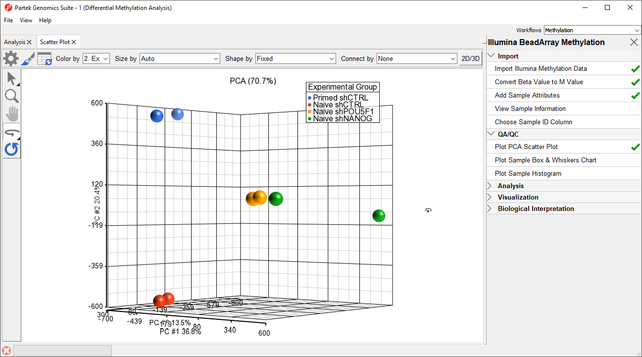 Image Removed Image Removed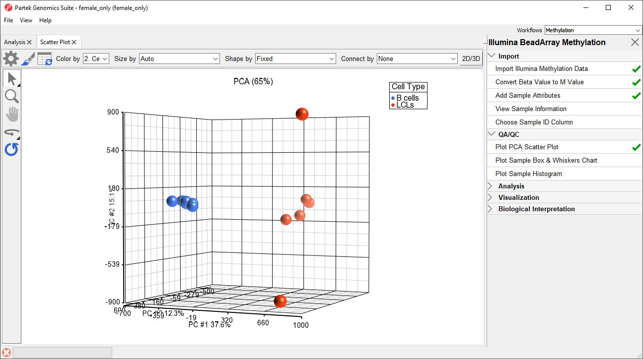 Image Added Image Added
|
Next, distribution of M-values across the samples can also be inspected by a box-and-whiskers plot.
...
| Numbered figure captions |
|---|
| SubtitleText | Box and whiskers plot showing distribution of M-values (y-axis) across the study samples (x-axis). Samples are colored by a categorical attribute (Experimental GroupCell Type). The middle line is the median, box represents the upper and the lower quartile, while the whiskers correspond to the 90th and 10th percentile of the data |
|---|
| AnchorName | box whiskers plot |
|---|
|
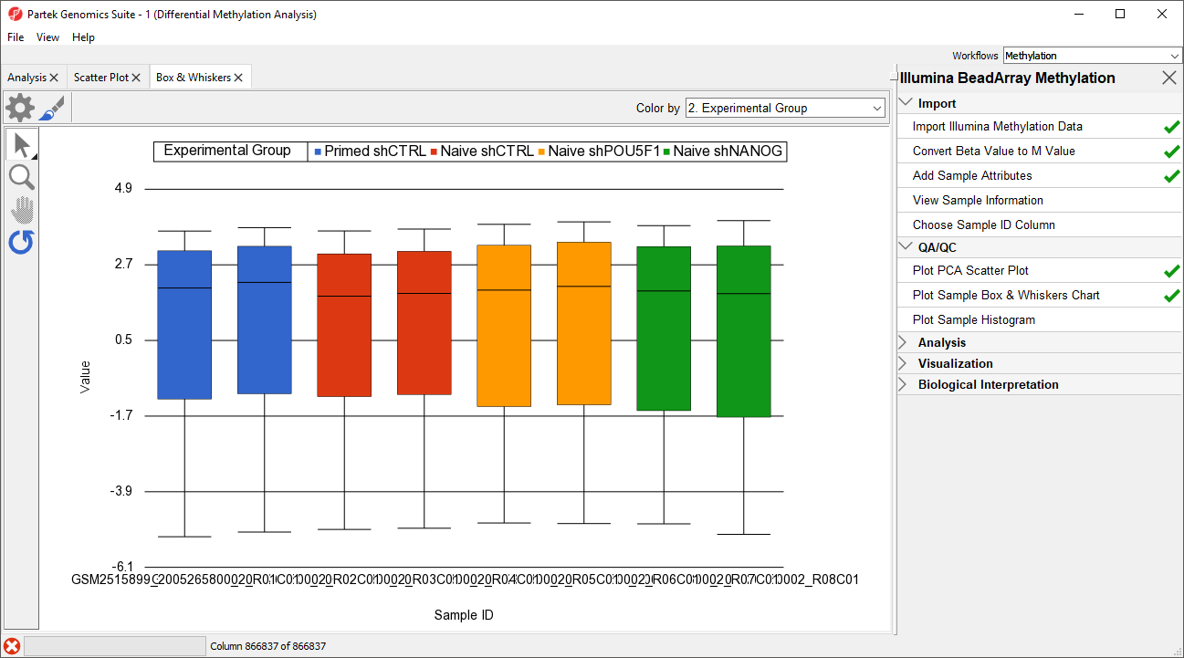 Image Removed Image Removed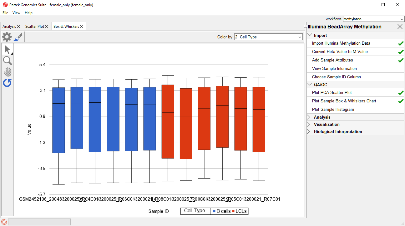 Image Added Image Added
|
An alternative way to take a look at the distribution of M-values is a histogram.
...
Again, no sample in the tutorial data set stands out, although there appears to be higher variance among the LCLs group (Figure 3).
| Numbered figure captions |
|---|
| SubtitleText | Sample histogram. Each sample is a line, M-values are on the horizontal axis and their frequencies on the vertical axis. Two peaks correspond to two probe types (I and II) present on the MethylationEPIC array. Sample colors correspond to a categorical attribute (Experimental GroupCell Type) |
|---|
| AnchorName | sample histogram |
|---|
|
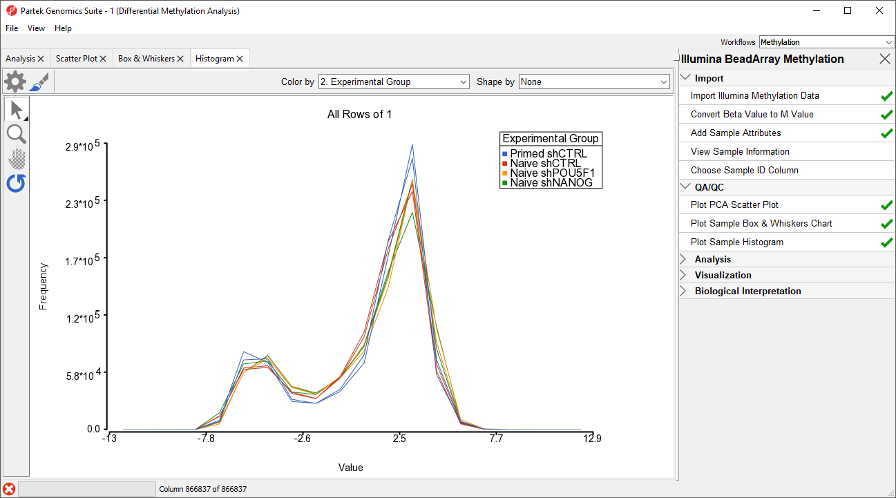 Image Removed Image Removed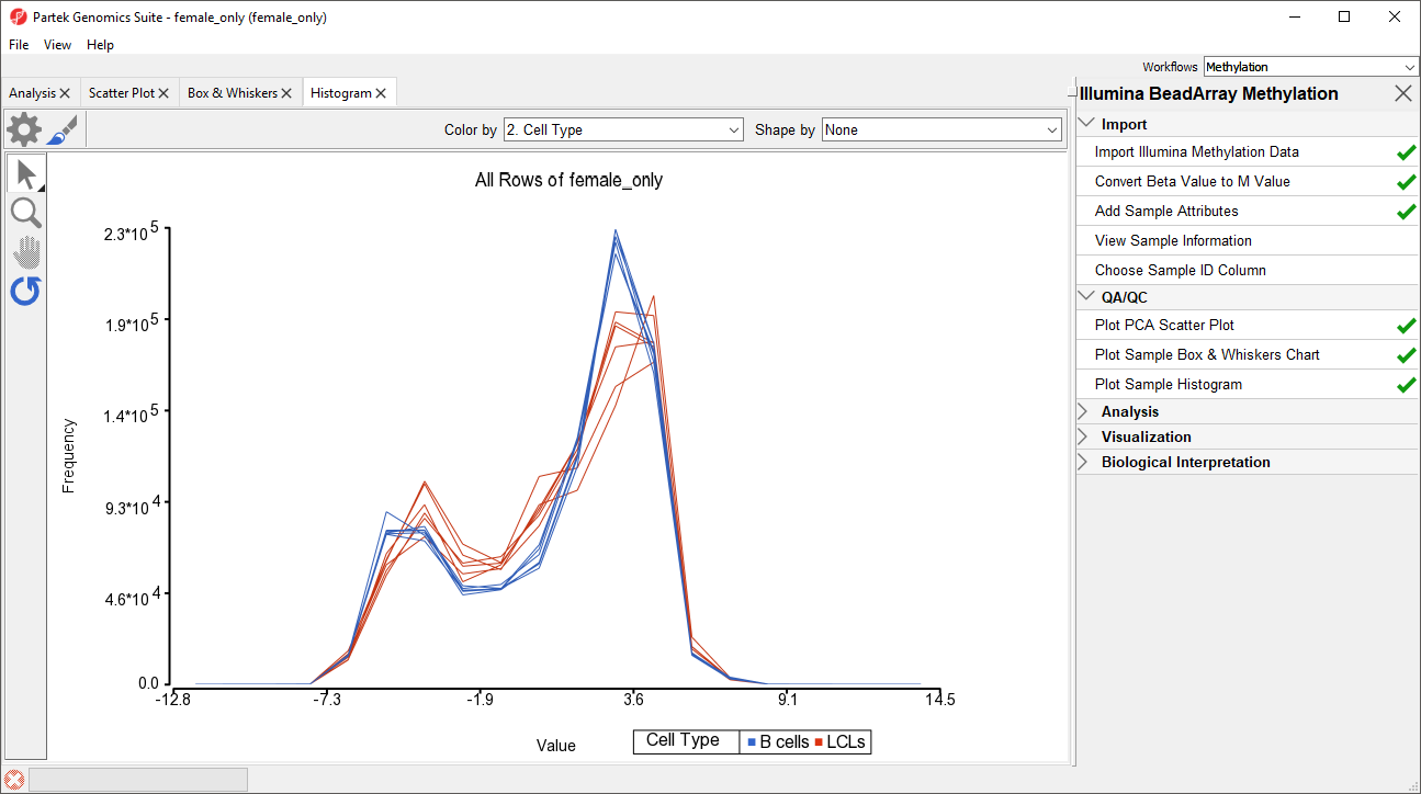 Image Added Image Added
|
...