Page History
| Table of Contents | ||||||
|---|---|---|---|---|---|---|
|
the The principal components analysis (PCA) scatter plot allows us to visualize similarities and differences between the samples in a data set.
- Select the Gene Counts Click the Normalized counts data node
- Select Visualizations from the task Click Exploratory analysis in the task menu
- Select PCA from the Visualizations section of the task menu
- Select Click PCA
- Click Finish to run PCA with the default options
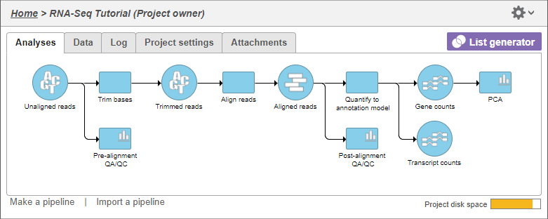
The PCA task node will be added to the pipeline (Figure 1)
| Numbered figure captions | ||||
|---|---|---|---|---|
| ||||
|
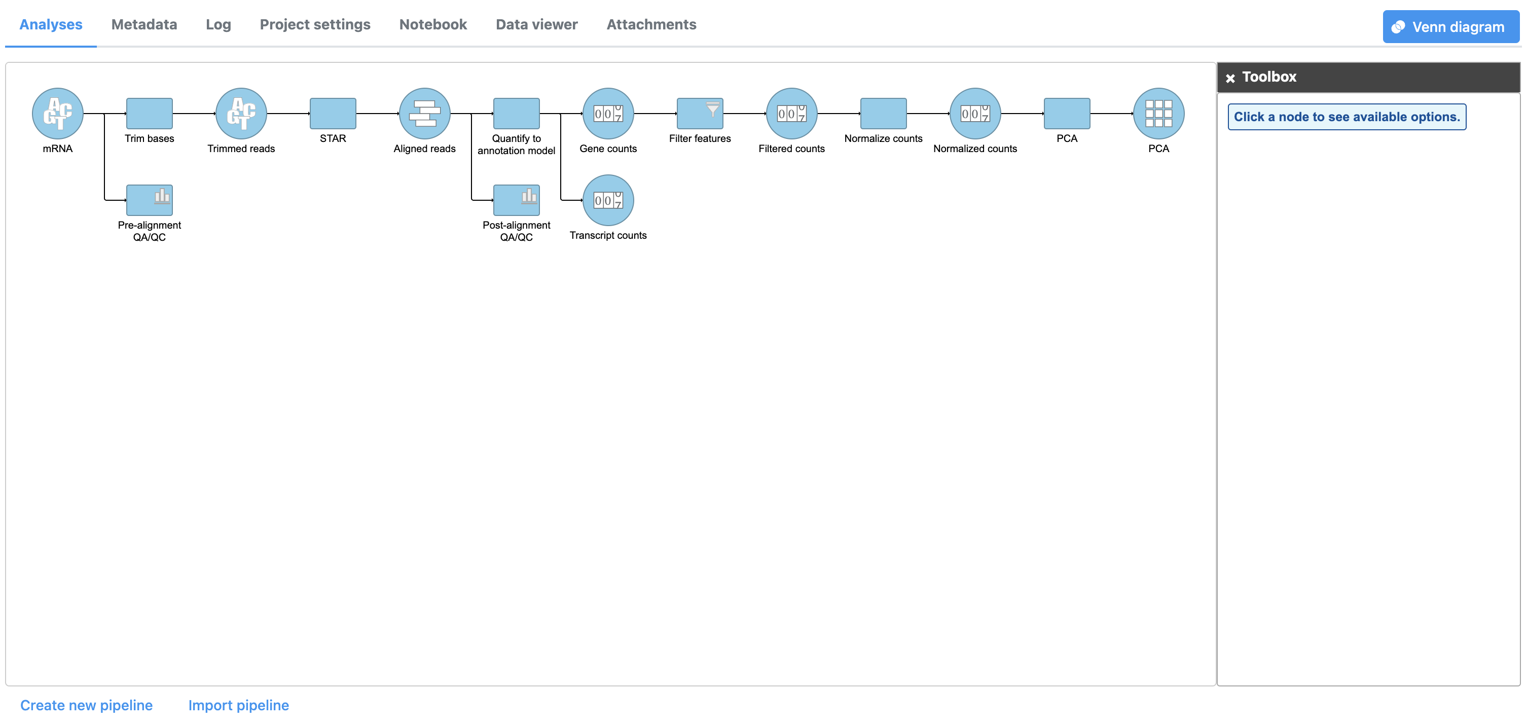
- Double click the PCA task node PCA data node to open the PCA scatter plot (Figure 2)
| Numbered figure captions | ||||
|---|---|---|---|---|
| ||||
| ||||
|

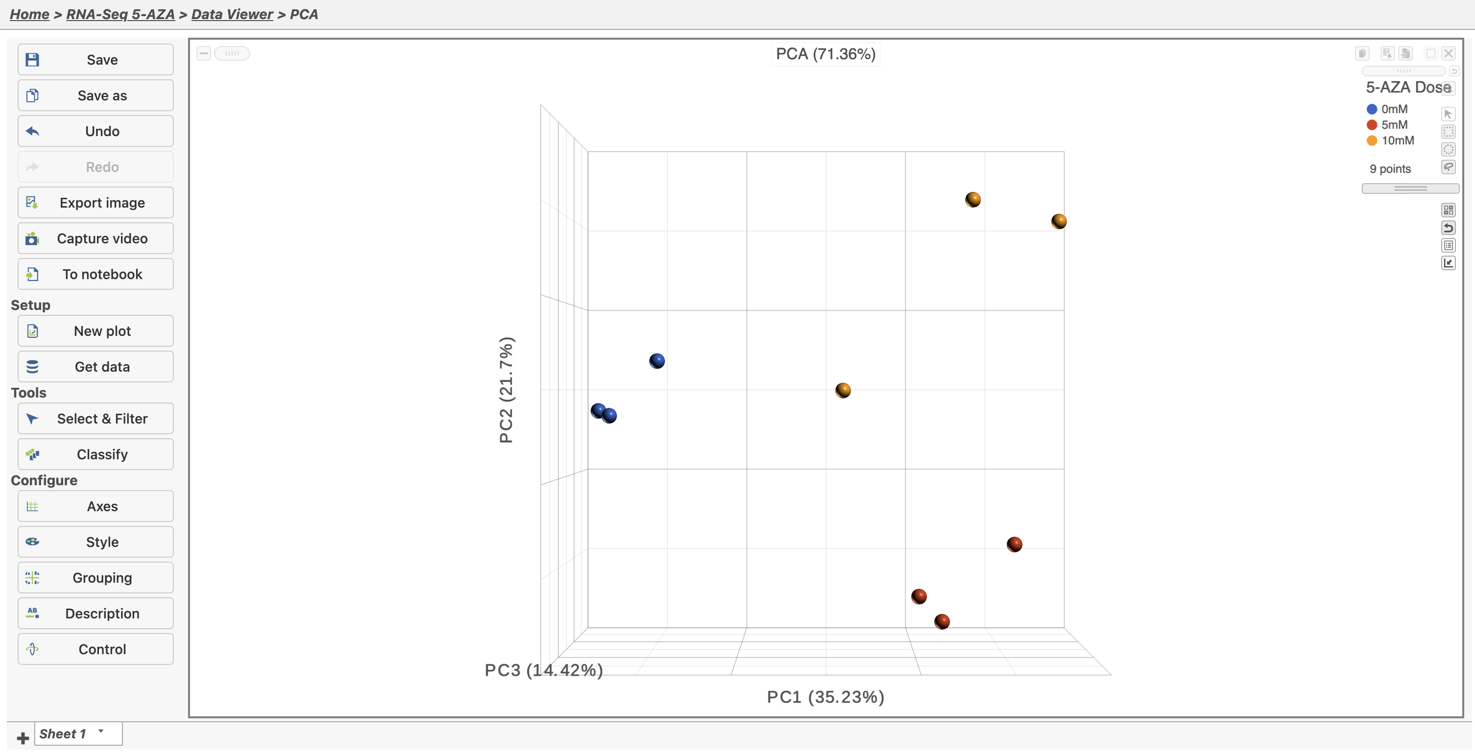
In the Data Viewer, click Style under Configure and set the Color by drop-down to 5-AZA Dose. The scatter plot shows each sample as a point sphere, colored by treatment group, in a three dimensional plot. The x, y, and z axes are the first three principal components. The percentage of total variance explained by each is listed next to the axis label. The size of each axis is determined by the variance along that axis. The plot is fully interactive; it can be rotated and points selected.
...
For more detailed information about the PCA scatter plot, please see the Principal Components Analysis PCA user guide.
| Page Turner | ||
|---|---|---|
|
| Additional assistance |
|---|
| Rate Macro | ||
|---|---|---|
|
...
Overview
Content Tools