Page History
...
Enrichment analysis is a technique commonly used to add biological context to a list of genes, such as list of significant genes filtered from differential analysis report. The procedure is based on assigning genes to groups and then finding overrepresented groups in filtered gene lists using a Fisher's exact test.
Running Gene set
...
Enrichment
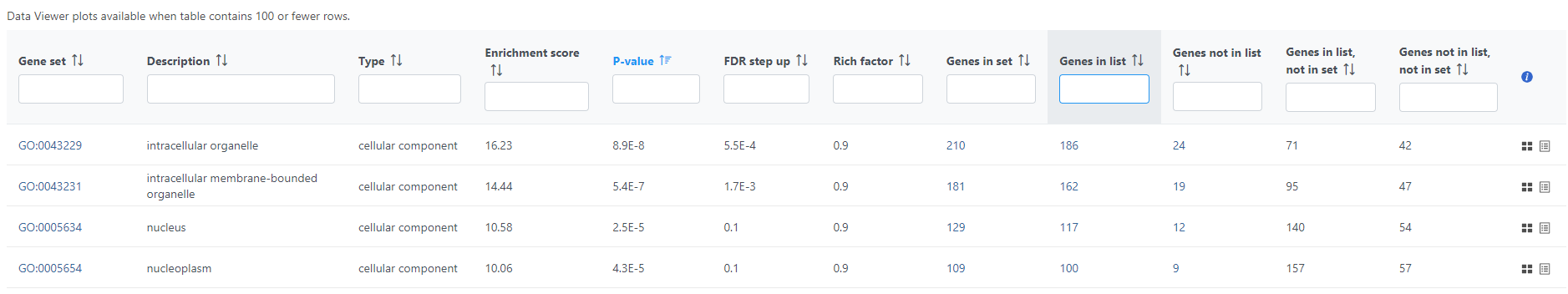
Gene set enrichment task can be invoked on a differential analysis output (or filtered differential analysis output) data node or filtered count matrix data node. Since the data node including all the features will server as serve as background, to get a meaningful result, always use a data node containing subset of features to invoke this task. Only gene names will be used in the computation.
...
| Numbered figure captions | ||||
|---|---|---|---|---|
| ||||
|
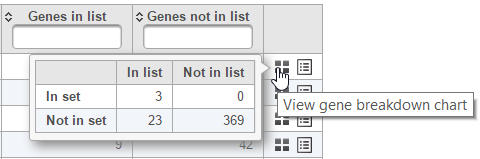
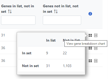
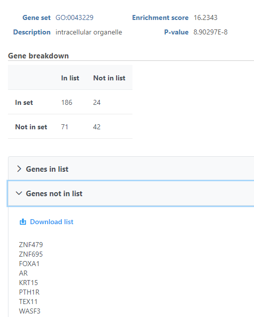
The contingency table (Figure 4) can be displayed by selecting the View gene breakdown chart icon on the right (![]() ). The term "list" refers to the list of significant genes, while the term "set" refers to the respective GO category. The first row of the contingency table is also seen in the report, namely the Genes in list and Genes not in list columns.
). The term "list" refers to the list of significant genes, while the term "set" refers to the respective GO category. The first row of the contingency table is also seen in the report, namely the Genes in list and Genes not in list columns.
| Numbered figure captions | ||||
|---|---|---|---|---|
| ||||
|
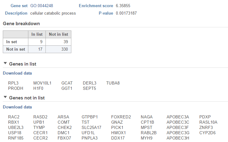
The View extra details (![]() ) button provides additional information on the GO category (Figure 5). In addition to the details already given in the report, a full list of Genes in list and Genes not in list can be inspected and downloaded (Download data) to the local computer as a text file. Use the arrow to expand these sections.
) button provides additional information on the GO category (Figure 5). In addition to the details already given in the report, a full list of Genes in list and Genes not in list can be inspected and downloaded (Download data) to the local computer as a text file. Use the arrow to expand these sections.
| Numbered figure captions | ||||
|---|---|---|---|---|
| ||||
|
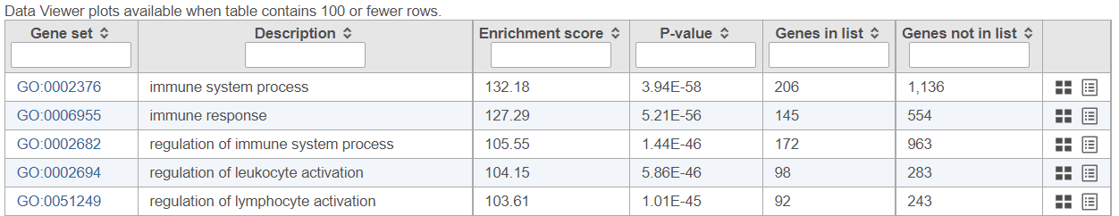
As previously mentioned, if you are using the GO gene sets distributed by Partek, the GO identifiers in the first column are hyperlinks to the Gene Ontology web-site entries (an example shown in Figure 6).
...
| Numbered figure captions | ||||
|---|---|---|---|---|
| ||||
|
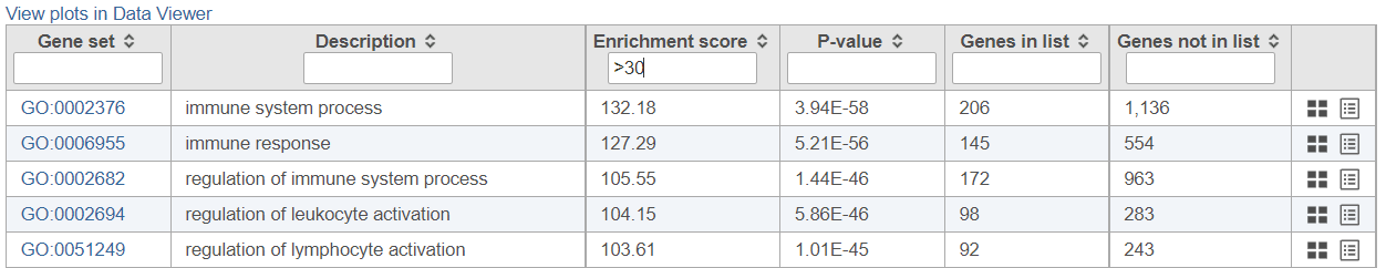
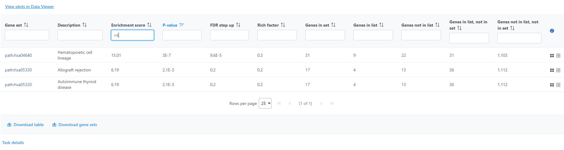
If needed, filter down the number results, for instance by using a cut-off based on the enrichment score. Type in the cut-off value in the text box beneath the Enrichment score and hit enter (an example is shown in Figure 11). Once the number or results falls below 100, a link to the Data Viewer will be displayed (Figure 8). Click on the View plots in Data Viewer link to open a new Data Viewer session.
| Numbered figure captions | ||||
|---|---|---|---|---|
| ||||
|
Two plots are loaded into Data Viewer (Figure 12). Both plots show enrichment score on the horizontal axis and gene ontology categories (i.e. the ones present in the gene enrichment table) on the vertical axis. The plots show enrichments scores (Enrichment score column of the gene ontology table) and - in addition - the plot on the left uses color range to depict enrichment P-value (green = low, red = high P-value).
...
Overview
Content Tools