Page History
...
The scatter plot will open in a new tab. We can add a regression line to the plot.
- Select (
 ) from the plot command bar
 - Select Axes
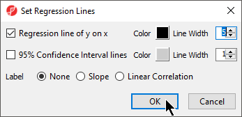
- Select Set Regression Lines
- Select Regression line of y on x
- Set Line Width to 5
- Select OK (Figure 2)
| Numbered figure captions | ||||
|---|---|---|---|---|
| ||||
|
...
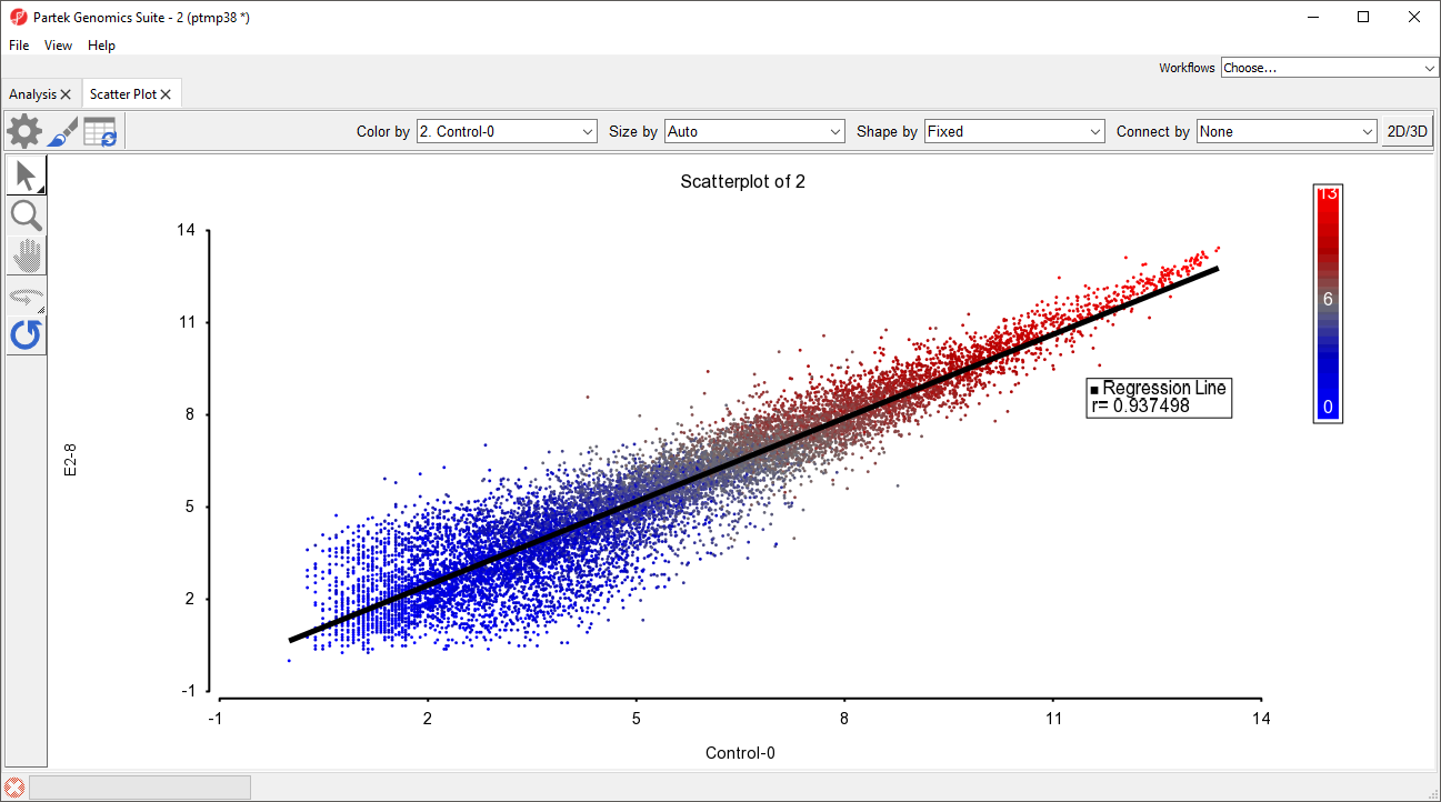
The scatter plot now features a regression line dividing the probe(sets)/genes (Figure 3).
| Numbered figure captions | ||||
|---|---|---|---|---|
| ||||
|
MA Plot
The MA plot can be used to disaply display a different difference in expression patters patterns between two samples. The horizontal axis (A) shows the average intensity while the vertical axis (M) shows the intensity ratio between the two samples for the same data point. In essence, an MA plot is a scatter plot tileted tilted to the side so that the differentially epxressed expressed probe(sets)/genes are located above or below the 0 value of M. An MA plot is also useful to visualize the results of normalization where you would hope to see the median of hte the values follow a horizontal line.
...
The MA plot will launch in a new tab showing the first two rows as the comparison (Figure 4).
| Numbered figure captions | ||||
|---|---|---|---|---|
| ||||
|
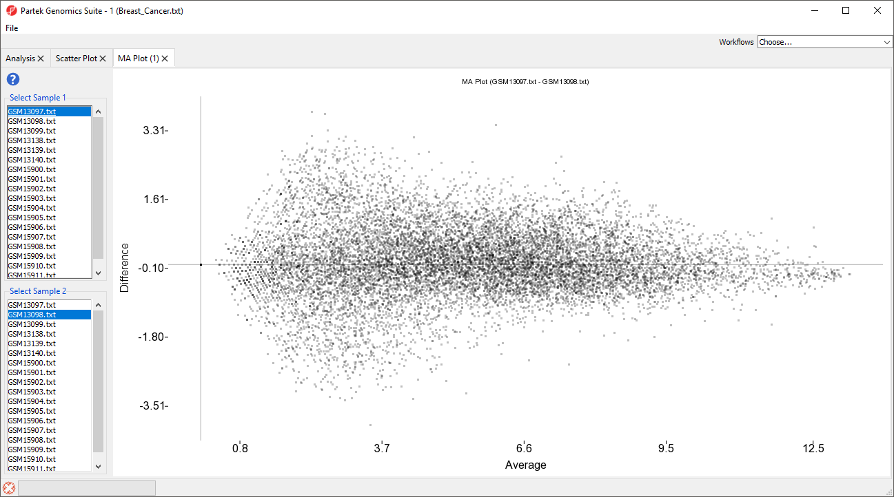
The samples displayed can be changed using the select sample menus on the left-hand side.
| Page Turner | ||
|---|---|---|
|
| Additional assistance |
|---|
| Rate Macro | ||
|---|---|---|
|
...
Overview
Content Tools