Page History
...
Principal component analysis (PCA) is a way to explore the overall similarity between samples to , visualize possible groupings within the data set or to , and detect outliers.
- Select PCA Scatter Plot from the QA/QC
| Numbered figure captions | ||||
|---|---|---|---|---|
| ||||
|

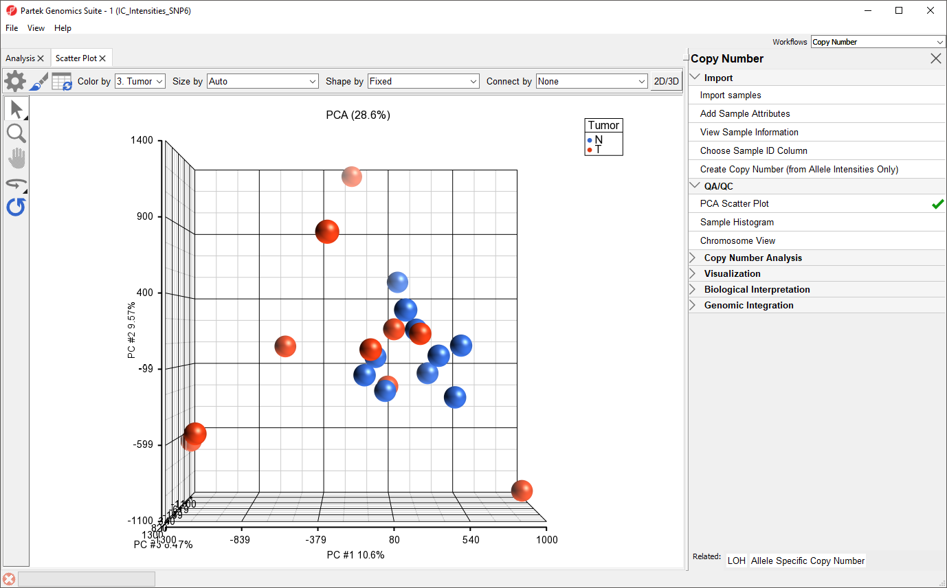
Each dot on the plot corresponds to a single sample and can be thought of as a summary of all normalized marker intensities for the sample. The first categorical column is used to color the plot; here, here tumor samples are shown in red and normal samples are shown in blue. For more information about the PCA plot, see
To better view the data, we can rotate the plot.
...
We can see that the peripheral blood samples (normal) cluster together whereas the cancer tissue samples (tumor) are more dispersed and show considerable variability with respect to their total allele intensity profiles. This corresponds well with the known genomic variability of cancer cells.
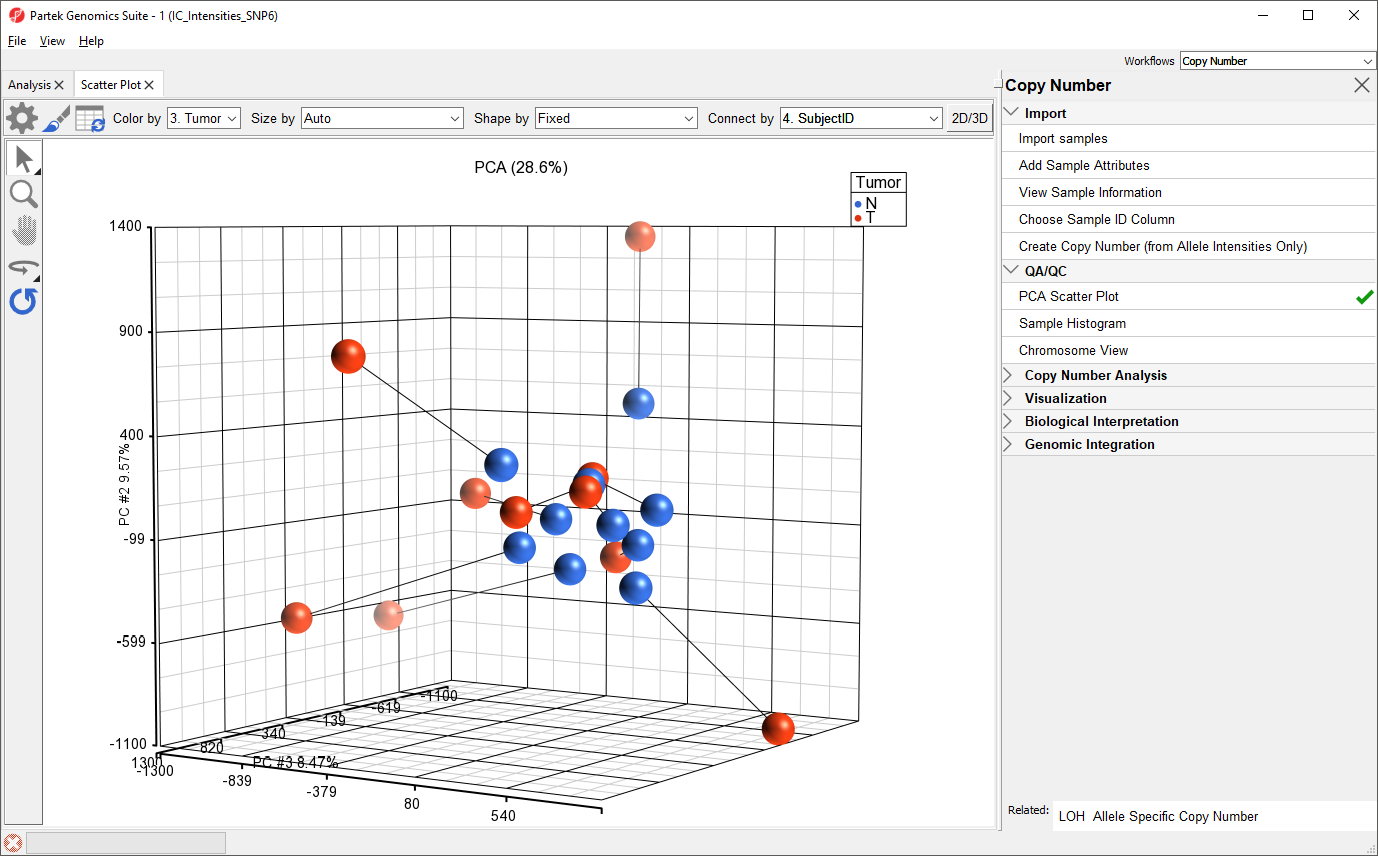
To view the similarity of paired normal and tumor samples from the same patient, we can connect dots by Subject ID.
- Select 4. SubjectID from the Connect by drop-down menu in the upper right-hand corner of the plot tab
Paired tumor and normal samples are now connected by lines, illustrating the range of differences between normal and tumor copy number in the data set (Figure 2).
| Numbered figure captions | ||||
|---|---|---|---|---|
| ||||
|
| Page Turner | ||
|---|---|---|
|
...
Overview
Content Tools