Page History
| Table of Contents | ||||||
|---|---|---|---|---|---|---|
|
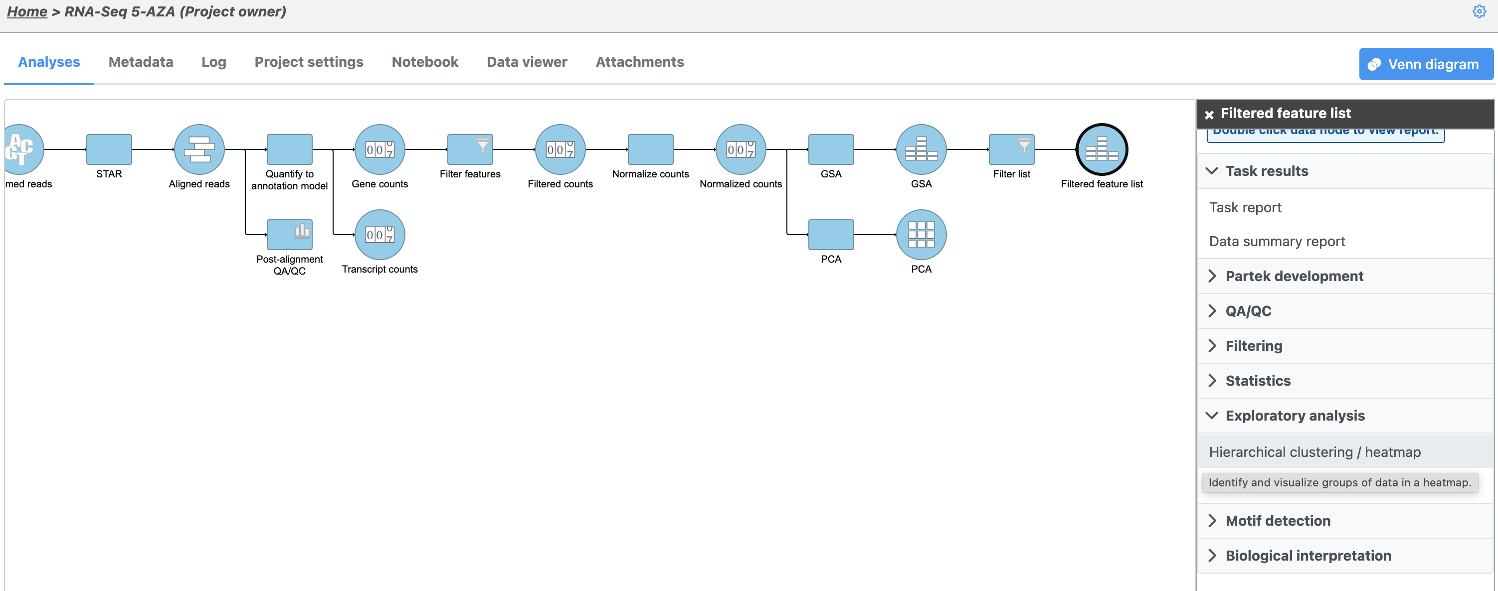
To check how well our list of differentially expressed genes distinguishes one treatment group from another, we can perform hierarchical clustering based on the gene list. Clustering can also be used to discover novel groups within your data set, identify gene expression signatures distinguishing groups of samples, and to identify genes with similar patterns of gene expression across samples.
- Click the Feature list data node
- Click Exploratory analysis in the task menu
- Click Hierarchical clustering (Figure 1)
| Numbered figure captions | ||||
|---|---|---|---|---|
| ||||
|
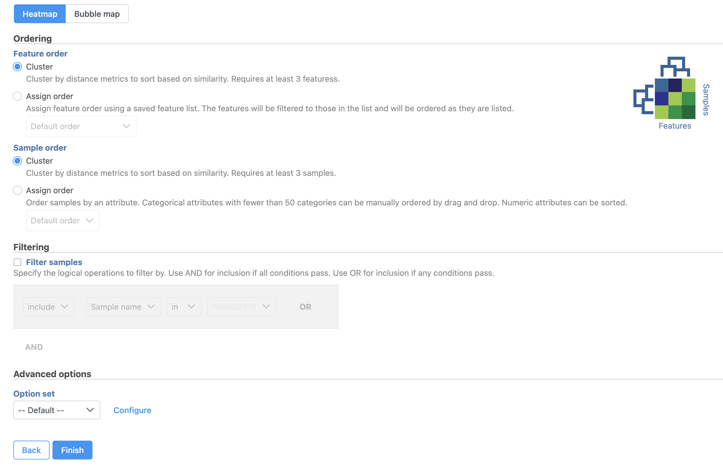
The Hierarchical clustering menu will open (Figure 2). Hierarchical clustering can be performed with a heatmap or bubble map plot. Cluster must be selected under Ordering for both Feature order and Cell order if both the features (columns) and cells (rows) are to be clustered.
| Numbered figure captions | ||||
|---|---|---|---|---|
| ||||
|
- Click Finish to run with default settings
A Hierarchical clustering task node will be added to the pipeline (Figure 3).
| Numbered figure captions | ||||
|---|---|---|---|---|
| ||||
|
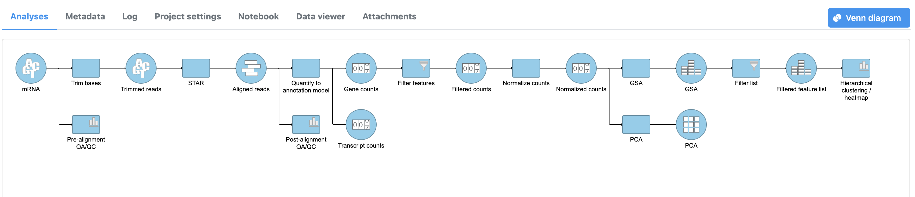
- Double-click the Hierarchical clustering / heatmap task node to launch the heatmap
The Dendrogram view will open showing a heatmap with the hierarchical clustering results (Figure 4).
| Numbered figure captions | ||||
|---|---|---|---|---|
| ||||
|
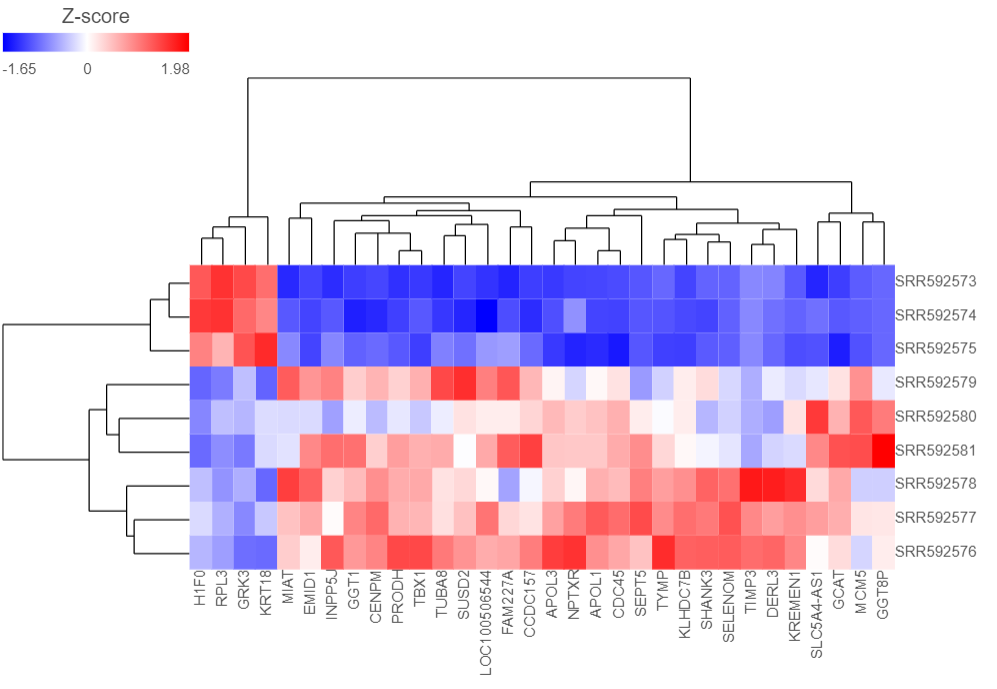
Samples are shown on rows and genes on columns. Clustering for samples and genes is shown through the dendrogram trees. More similar samples/genes are separated by fewer branch points of the dendrogram tree.
The heatmap displays standardized expression values with a mean of zero and standard deviation of one.
The heatmap can be customized to improve data visualization using the menu on the Configuration panel on the left.
- Expand the Annotations > Data card.
- Click on the gray button
 on the right hand side of Row annot None available
 - In the dialog, click on the Gene counts node
- Now set the Row annot to 5-AZA Dose
Samples are now labeled with their 5-AZA Dose group (Figure 5).
| Numbered figure captions | ||||
|---|---|---|---|---|
| ||||
|
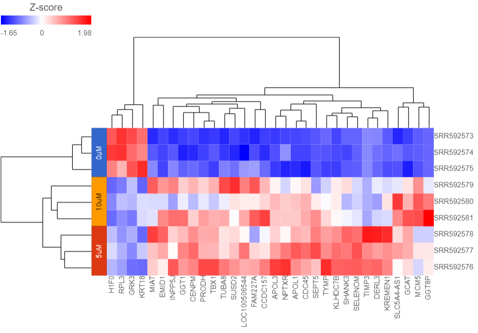
Samples cluster based on treatment group and the 5μM and 10μM groups are more similar to each other than to the 0μM group.
We can save the heatmap as a publication-quality image.
- Click the Export image icon
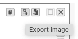 in the top right corner of the plot
 - Choose size and resolution using the Save as SVG dialog (Figure 6)
| Numbered figure captions | ||||
|---|---|---|---|---|
| ||||
|
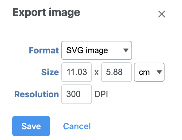
- Select Save
The heatmap will be saved as a .svg file and downloaded in your web browser.
For more information about hierarchical clustering and the Dendrogram view, please see the Hierarchical Clustering user guide.
| Page Turner | ||
|---|---|---|
|
| Additional assistance |
|---|
| Rate Macro | ||
|---|---|---|
|
Overview
Content Tools