Page History
A Pie Chart histogram is a type of graph that displays data in a circular graph. It gives you a snapshot of how a group is broken down into smaller pieces. Because the pieces of a Pie chart are proportional to the fraction of the whole in each category. In order to make a Pie chart, you must have a list of categorical variables (descriptions of your categories, like ‘cell type’) as well as numeric variables (e.g., cell numbers). In Partek® Flow®, the default numeric variable is the cell numbers. Therefore, the Pie chart indicates the fraction of the whole cell numbers in each category.To make a Pie chart, open a new Data Viewer session in Flow plot that summarizes the underlying frequency of a set of data with the variable of interest on one axis and the frequency distribution of that variable in the other axis. In Partek Flow, histogram can be invoked on continuous or categorical variable.
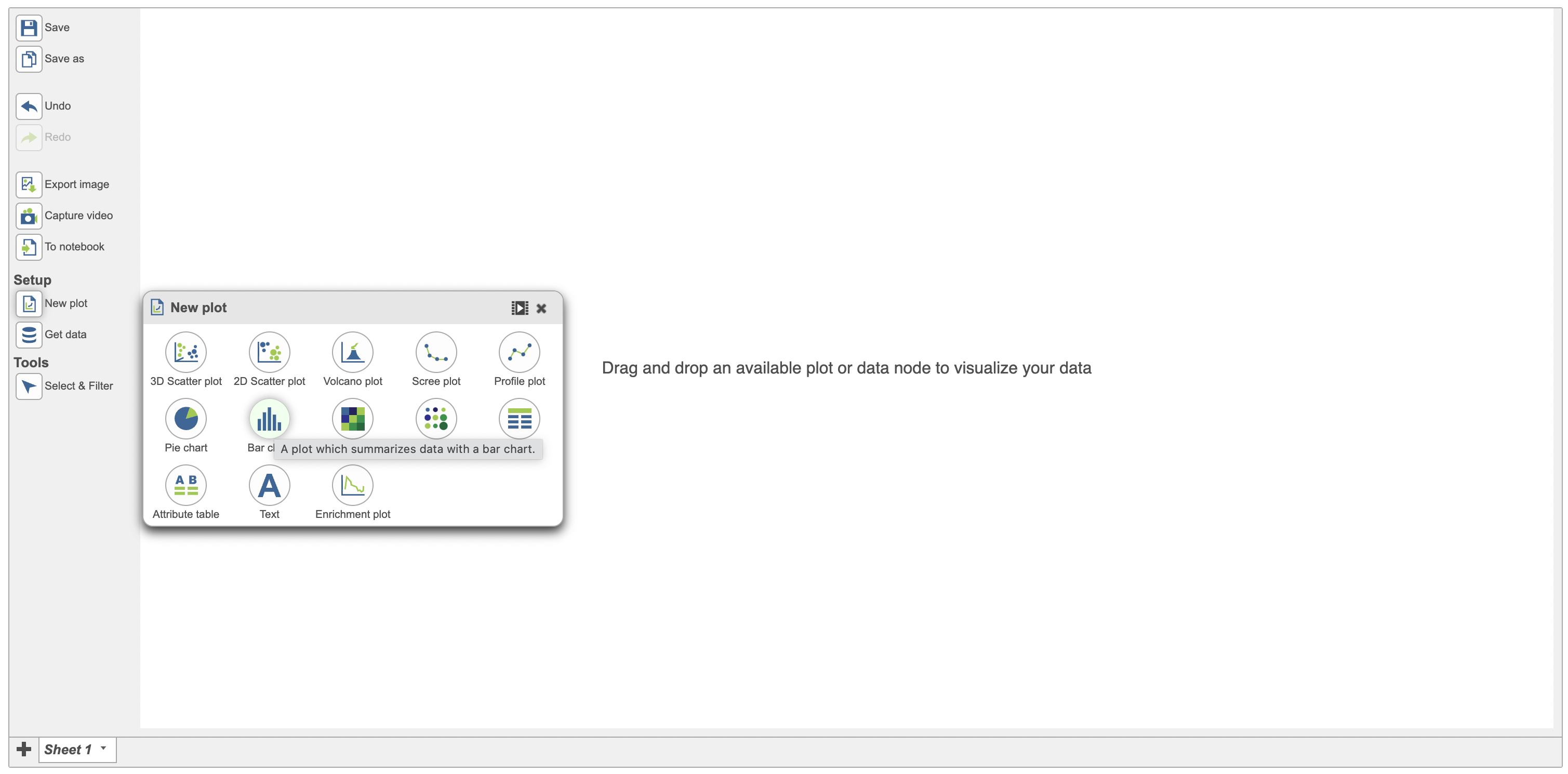
From a data viewer session, click on New plot > Bar chart (Figure 1).
| Numbered figure captions | ||||
|---|---|---|---|---|
| ||||
|

...
| |
|
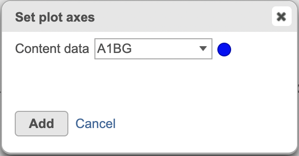
Upon clinking on the Bar chart menu, a dialogue opens up with the different data sources that can be displayed on the histogram. Select your data node of interest and the content data (Figure 2).
| Numbered figure captions | ||||
|---|---|---|---|---|
| ||||
|
Categorical attributes that can be used for the Pie chart would display after any data node from the Data card on the left side of the Data Viewer has been clicked.
...
| |||
|
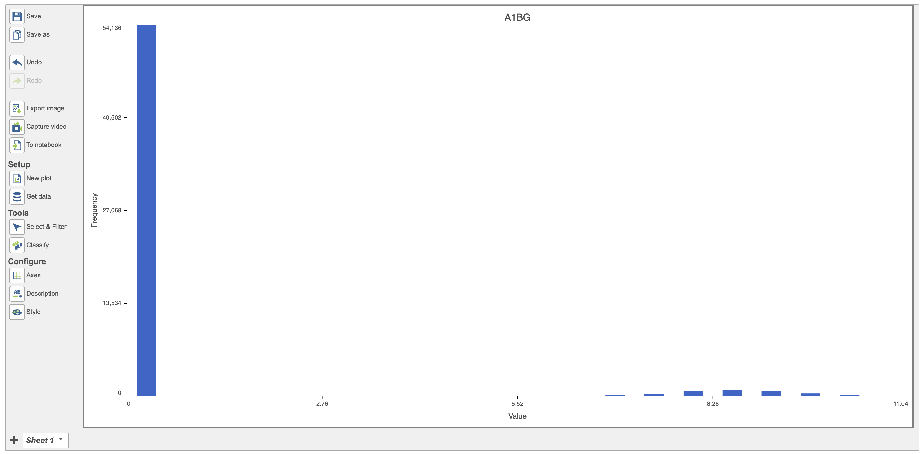
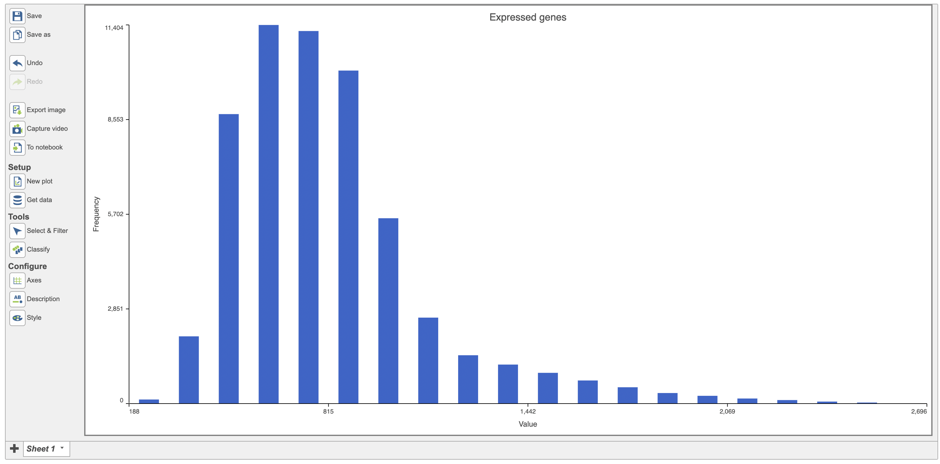
The first row in the data will be displayed by default in the histogram and in this case, it is the histogram of the expression values for the gene A1BG (Figure 3).
| Numbered figure captions | ||||
|---|---|---|---|---|
| ||||
|

...
| |
|
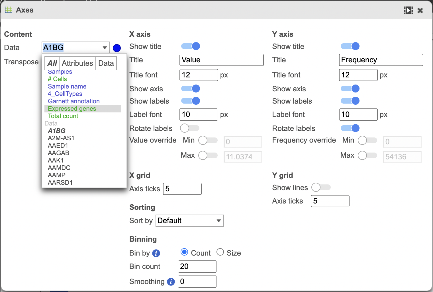
Change the data displayed on the histogram by using the Configure > Axes menu and selecting the desired variable to display. Here the data displayed was switched to “Expressed genes” which is a continuous variable (Figure 4).
| Numbered figure captions | ||||
|---|---|---|---|---|
| ||||
|

...
| |||
|
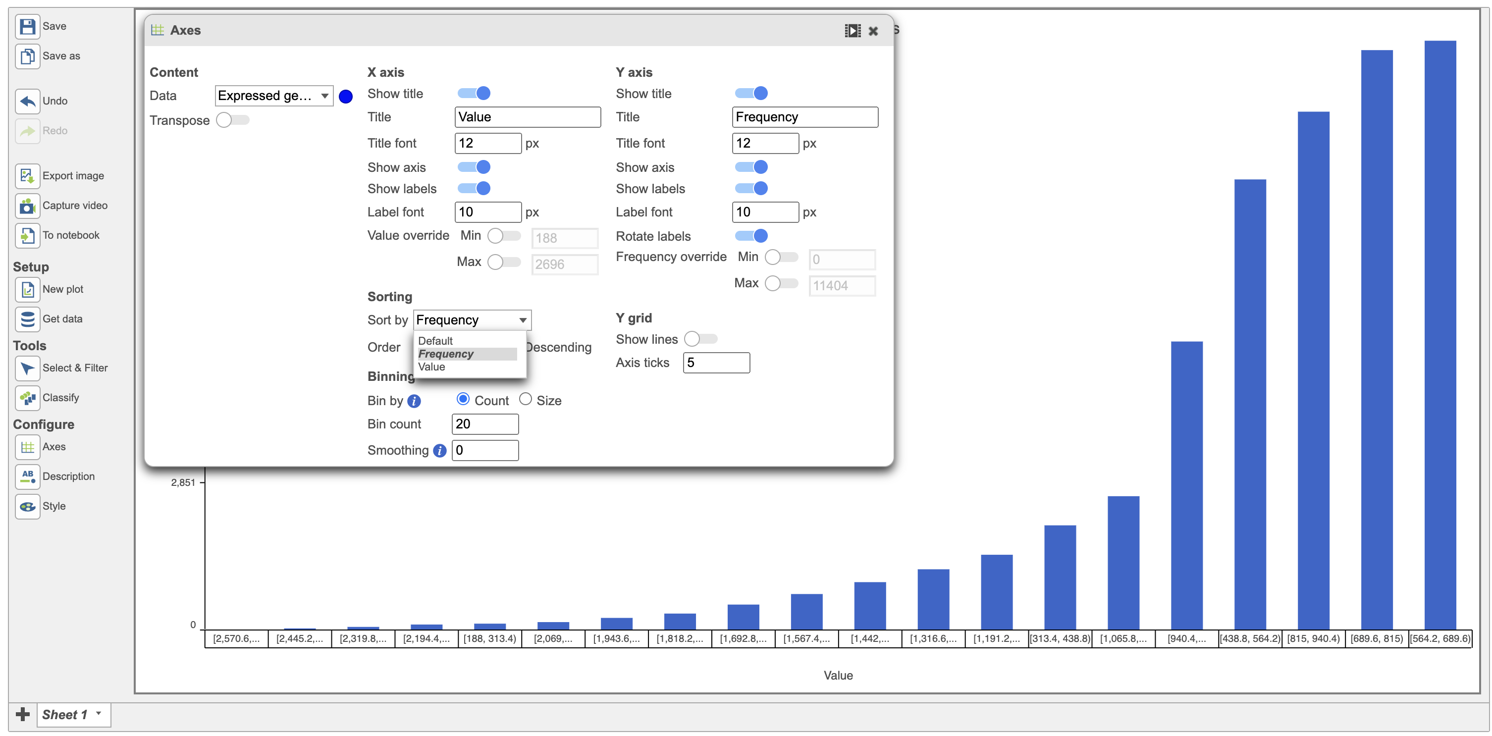
Use the "Sort by" function to sort the plot. The default sorting is by Value on the x-axis and this default setting is sorted in ascending order. Users have the option to change that by changing the Default to value or frequency in the sort option (Figure 5)
| Numbered figure captions | ||||
|---|---|---|---|---|
| ||||
|

Configuration card (red rectangle in Figure 6) for Pie chart in Flow includes the options:
- Data: multiple categorical attributes can be added to data source; Users are allowed to rearrange their order by dragging when having multiple categorical attributes (Figure 7).
- Split by: split the current Pie chart by a second categorical attribute (Figure 6)
- Color mode: Unique colors (default), Similar colors.
- Title: Title name, Title font size (16 px as default)
- Style: Order slices by Count or Category
| |||
|
Users can color the histograms by a categorical attribute using the Color by function (in red below). The bars were colored by the graph-based classifications in the example below (Figure 6).
| Numbered figure captions | ||||
|---|---|---|---|---|
| ||||
|
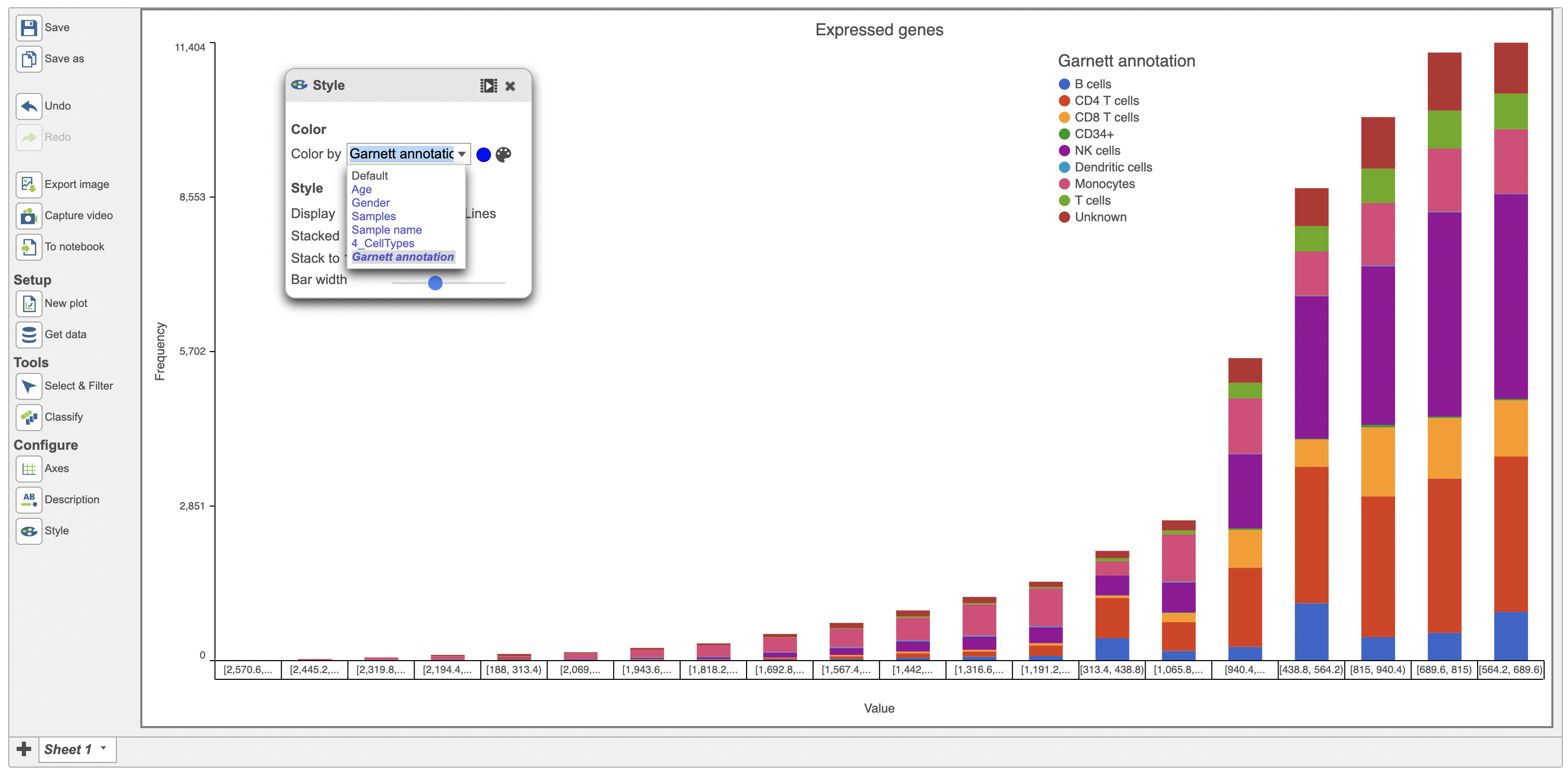
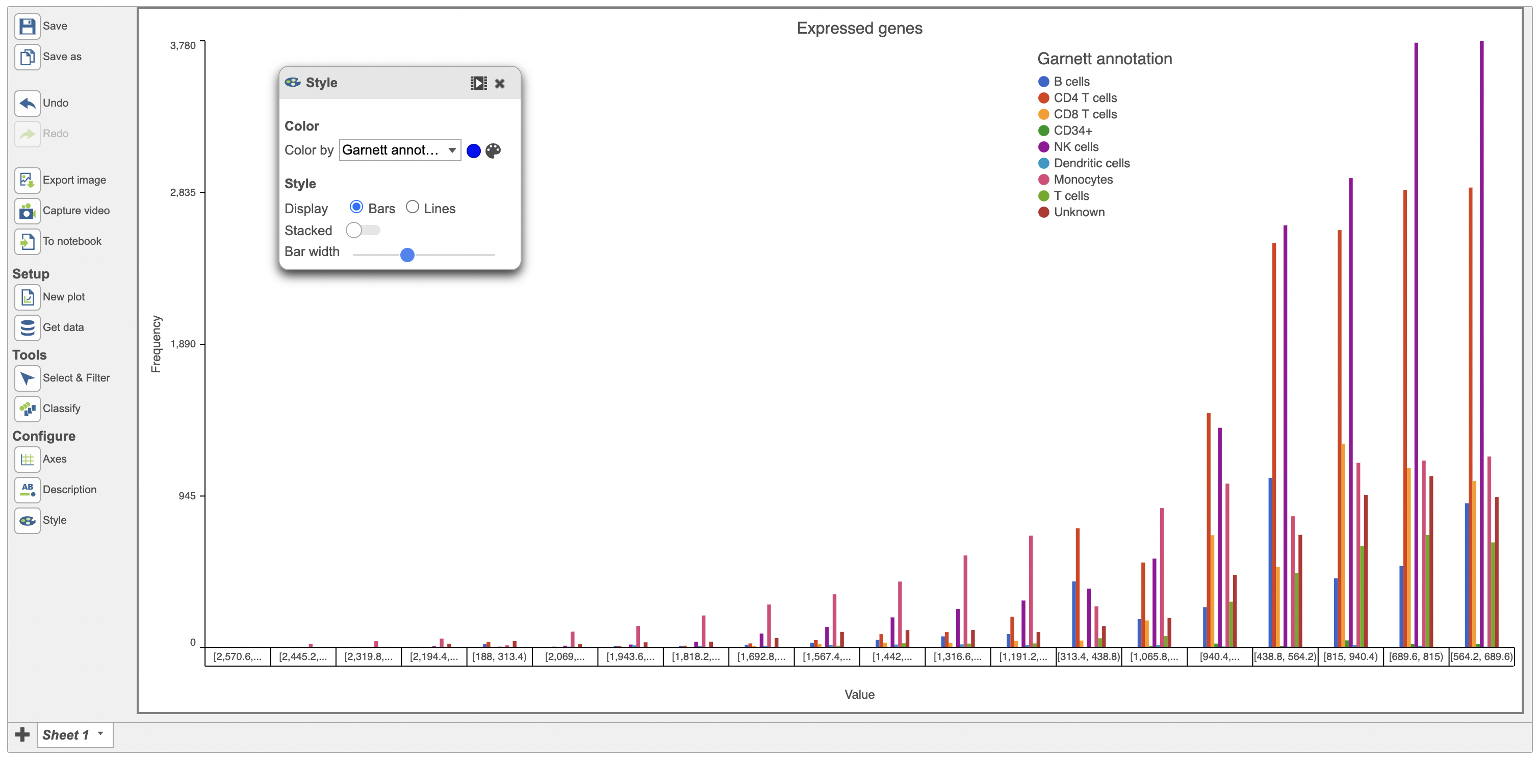
The bars in the histogram above were stacked. They can be unstacked using the Style menu as seen below in red (Figure 7).
| Numbered figure captions | ||||
|---|---|---|---|---|
| ||||
|

...
| |
|
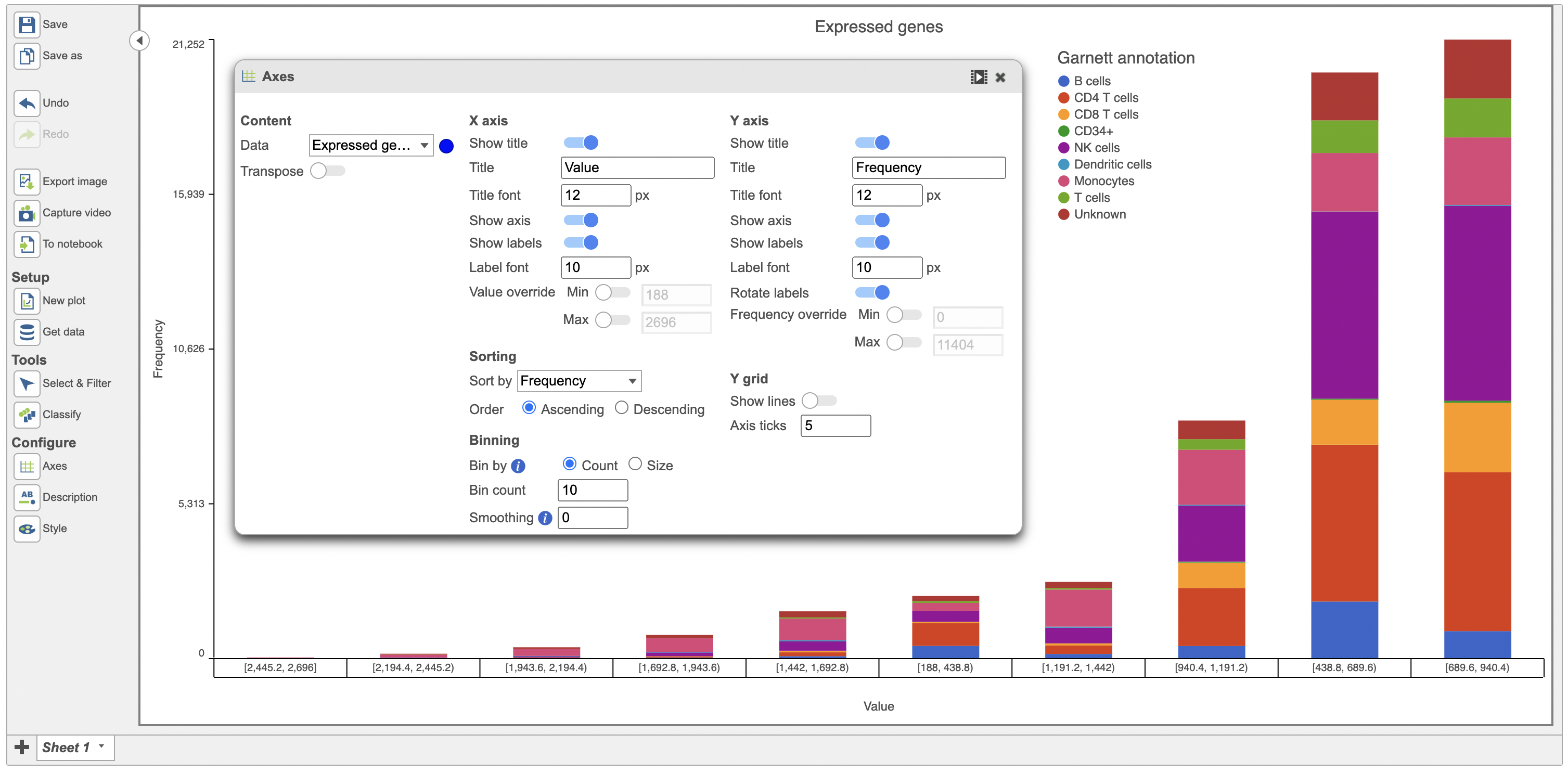
Users also have the option to bin by either Count or Size. When binned by Count, the user specifies the number of bins for the data and the distribution is fit into the specified number of bins. Data below is binned by Count (Figure 8).
| Numbered figure captions | ||||
|---|---|---|---|---|
| ||||
|

...
| |
|
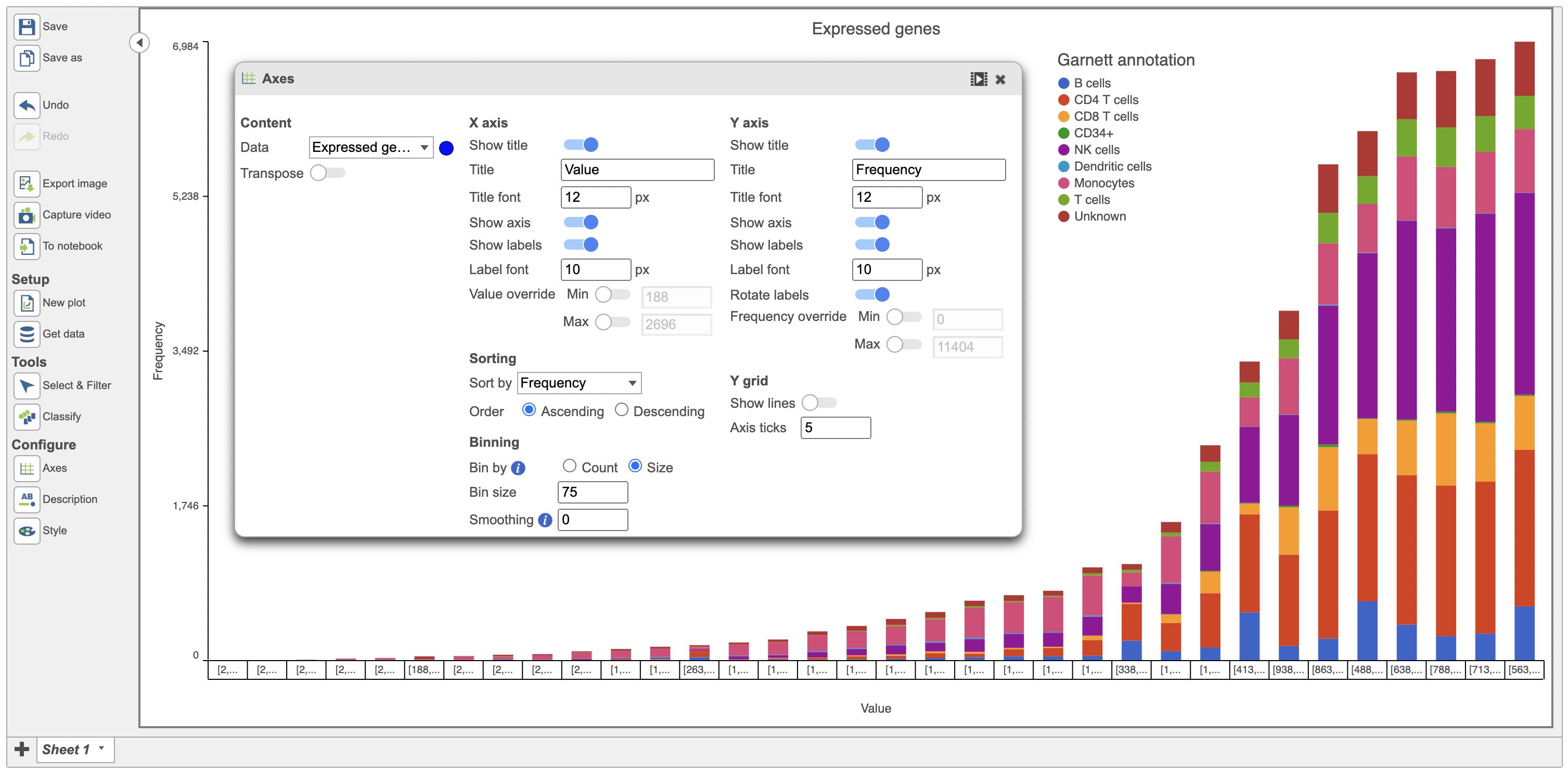
When binned by Size, the user specifies the number of items in the bin (size of a bin). This is used to calculate the number of bins required for the data. Data below is binned by Size (Figure 10).
| Numbered figure captions | ||||
|---|---|---|---|---|
| ||||
| ||||
| ||||
|

ghjkl
Click the Save image button ![]() to save a PNG or SVG image to your computer.
to save a PNG or SVG image to your computer.
Click the Send to notebook button ![]() to send the image to a page in the Notebook.
to send the image to a page in the Notebook.
ghjkl
ghjkl
ghjkl
Additional Assistance
If you need additional assistance, please visit our support page to submit a help ticket or find phone numbers for regional support.
...
Overview
Content Tools