Page History
...
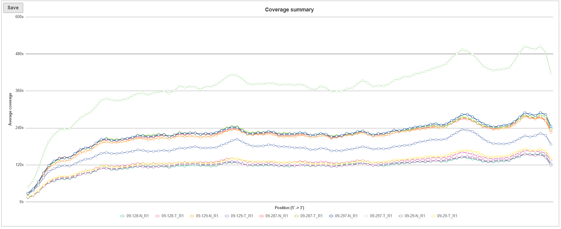
The Coverage summary (Figure 6) plot is an overview of coverage across of the targeted genomic features for all the samples in the project. Each line within the plot is a single sample, the horizontal axis is the normalized position within the genomic feature, represented as 1st to 100th percentile of the length of the feature, while the vertical axis show the average coverage (across all the features for a given sample).
| Numbered figure captions | ||||
|---|---|---|---|---|
| ||||
|
If you need more details about a sample, click on the sample name in the Coverage report table (Figure 7). The columns are as follows:
...
Overview
Content Tools