Page History
...
| Numbered figure captions | ||||
|---|---|---|---|---|
| ||||
|
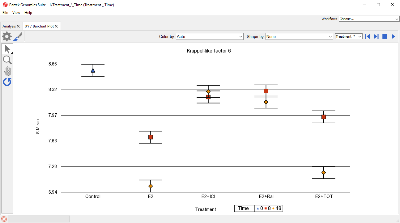
- Select (
 ) from the plot command bar
 - Set X-Axis to 3. Time using the drop-down menu
- Set Separate by to 2. Treatment using the drop-down menu
- Select OK
To help visualize the connection between time points, we can add connecting lines.
- Select (
 ) from the plot command bar
 - Set Plot Style to lines using the drop-down menu
- Select OK
...
While most of the plot controls are shared with Dot Plot, XY Plot does have a few unique options.
- Select Fly Through (
 ) to automatically cycle through each row (gene) in the source spreadsheet
 - Select (
 ) to stop the cycling
Fly Through This feature is useful when performing visual analysis of patterns in gene expression changes in a list of genes.
The drop-down menu adjacent to the previous/next (![]() ) controls lets you switch source spreadsheets.
) controls lets you switch source spreadsheets.
...
Overview
Content Tools