Page History
...
| Numbered figure captions | ||||
|---|---|---|---|---|
| ||||
|

Select New plot > Pie chart from ‘Available plots’ chart from the menu on the left side and drag it to Add new plot in middle panel. Then select any data node to create a new empty Pie chart (Figure 2).
...
| Numbered figure captions | ||||
|---|---|---|---|---|
| ||||
|
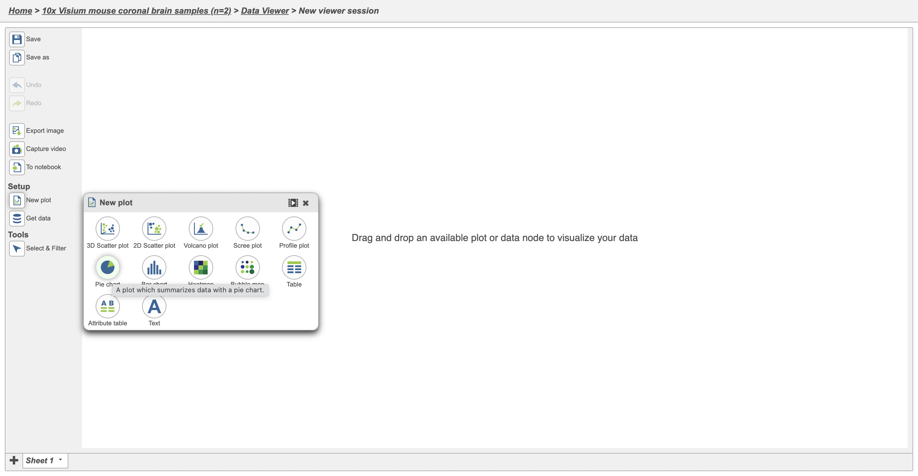
Categorical attributes that can be used for the Pie chart would display after any data node from the Data card on the left side of the Data Viewer has been clicked.
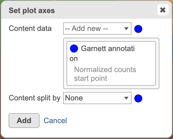
Simply drag and dropSimply select the attribute, Sample name as an example here, to the Add data in the middle panel in this case cell type, to generate a new Pie chart (Figure 3).
| Numbered figure captions | ||||
|---|---|---|---|---|
| ||||
|

A Pie chart that demonstrates the fraction of the whole cell numbers in each sample has been created (Figure 4).
...
| Numbered figure captions | ||||
|---|---|---|---|---|
| ||||
|

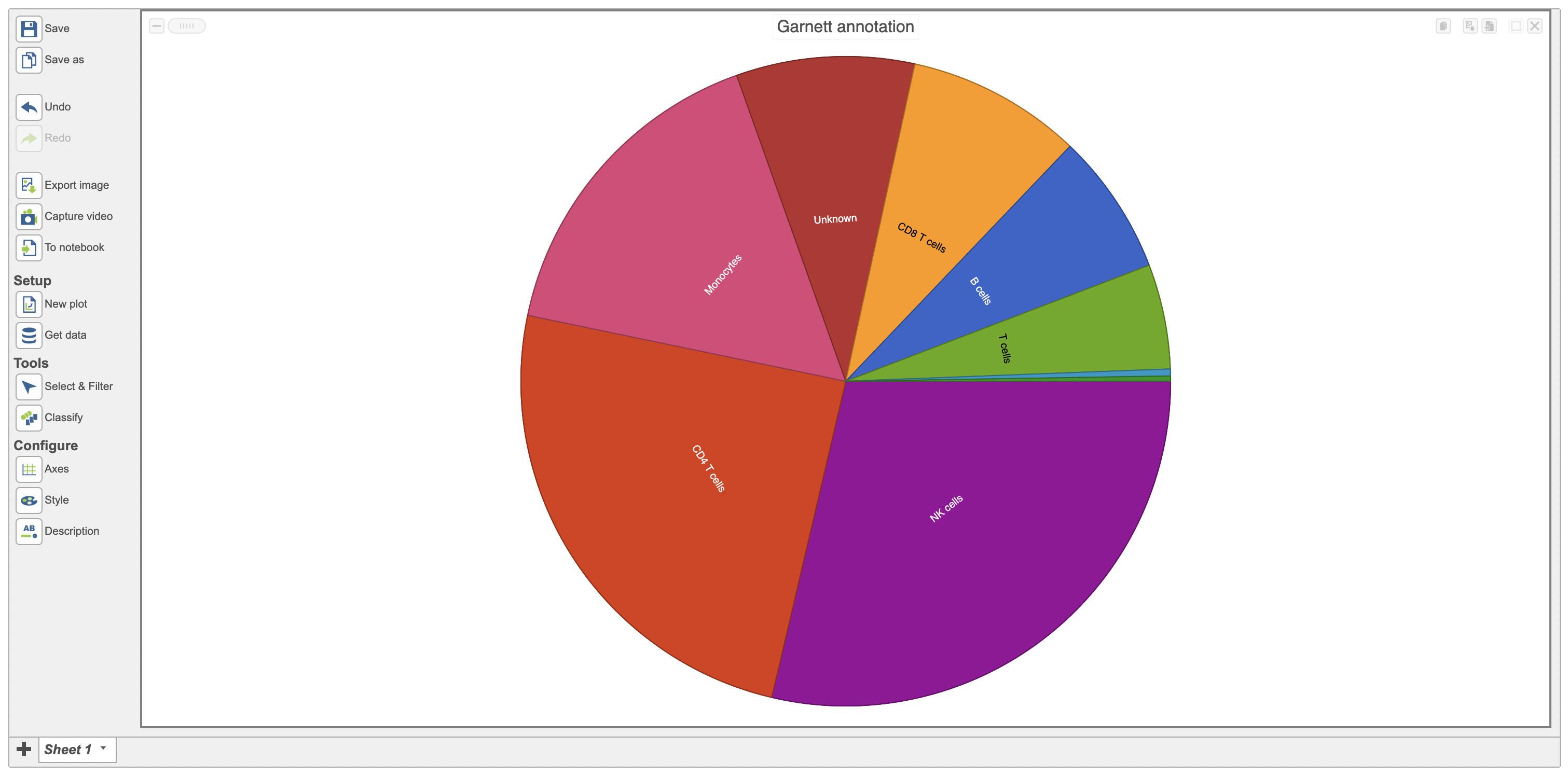
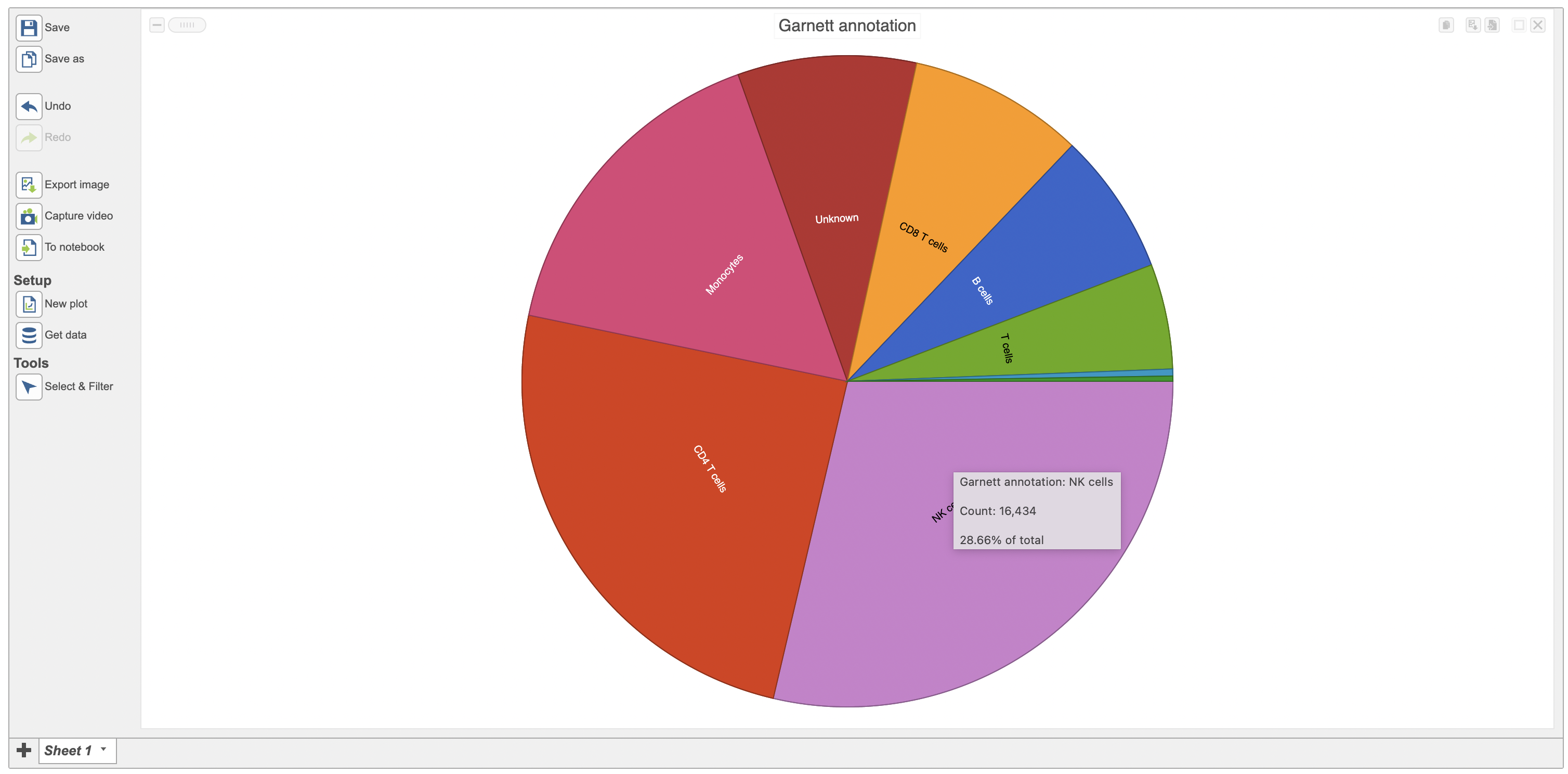
The specific cell number in this category and its percentage of total would appear when a cursor is moved over on it. For instance, the second sample (Sample2) includes 2285 cells NK cells include 16,434 cells which accounts for 36.149% 2866% of the total cells in the study (Figure 5).
...
| Numbered figure captions | ||||
|---|---|---|---|---|
| ||||
|

Configuration card (red rectangle in Figure 6) for Pie chart in Flow includes the options:
- Data: multiple categorical attributes can be added to data source; Users are allowed to rearrange their order by dragging when having multiple categorical attributes (Figure 7).
- Split by: split the current Pie chart by a second categorical attribute (Figure 6)
- Color mode: Unique colors (default), Similar colors.
- Title: Title name, Title font size (16 px as default)
- Style: Order slices by Count or Category
|
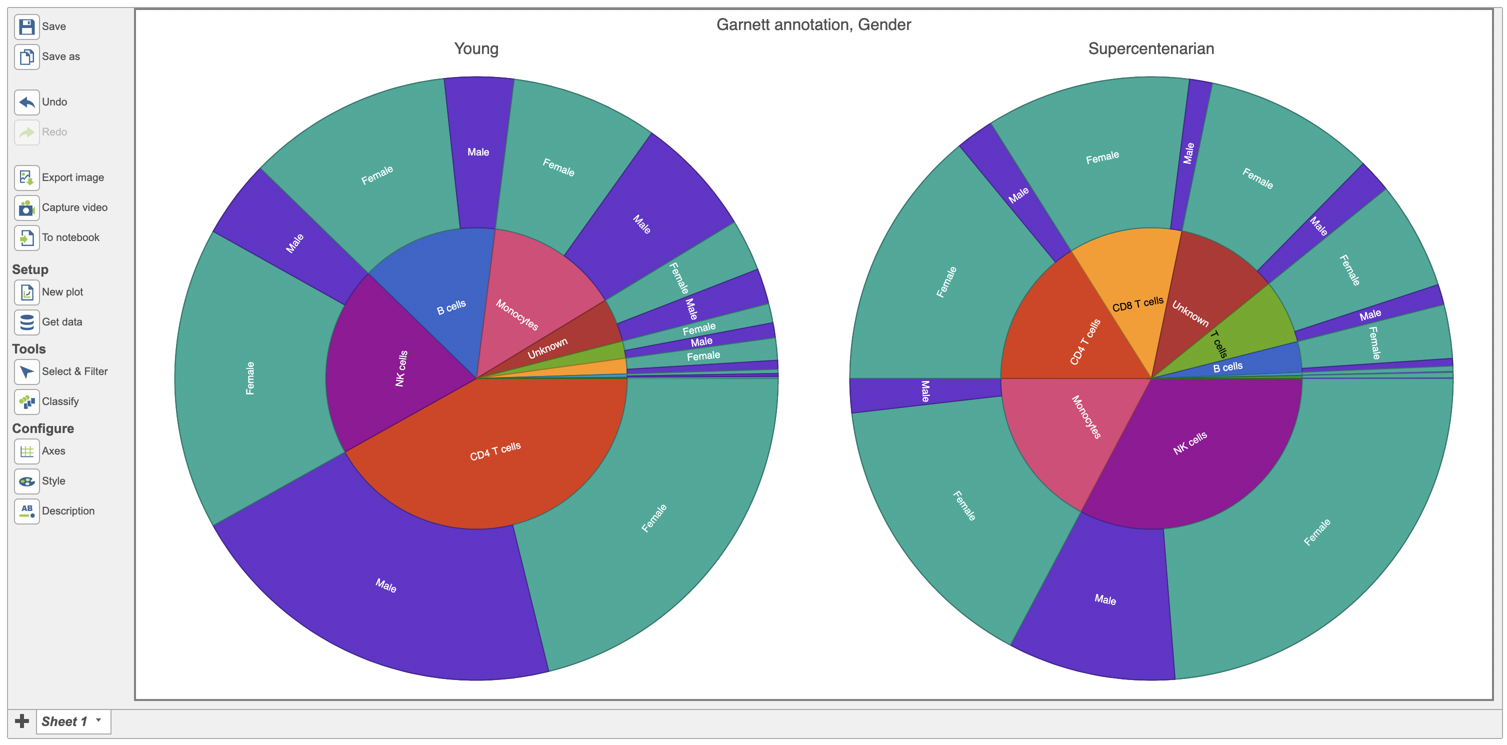
Accessing the Configure > Axes menu you can easily split the plot by any categorical attribute available, in this case the Pie chart was split by age (Figure 6)
| Numbered figure captions | ||||
|---|---|---|---|---|
| ||||
|


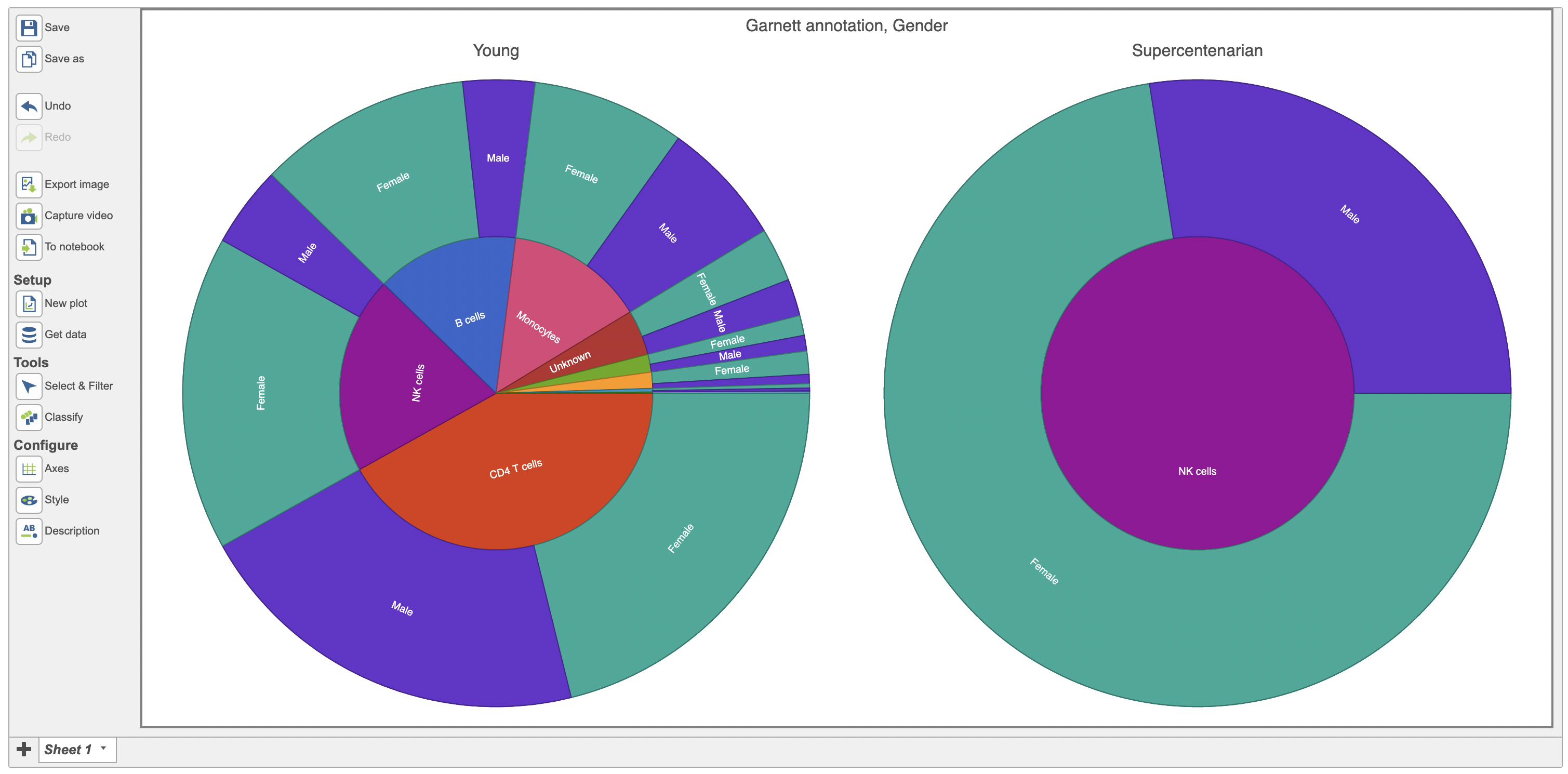
If more than one categorical attribute were added to the data, Pie chart would have two different modes - Pointer mode and Zoom mode (Figure 7). The default is Pointer mode, so if users would like to look closer at some slice please click the Zoom mode first. ↩ represents Reset zoom. is accessed by clicking on the zoom icon ![]() and subsequently clicking on any slice of interest. In this case Figure 7 shows the distribution of NK cells between male and female patients in the supercentenarian panel.
and subsequently clicking on any slice of interest. In this case Figure 7 shows the distribution of NK cells between male and female patients in the supercentenarian panel.
| Numbered figure captions | ||||
|---|---|---|---|---|
| ||||
|

Once you are pleased with the appearance of the Pie plot, push Save image button to save it to the local machine or click Save button to save the Data Viewer. The resulting dialog (Figure 8) controls the Format, Size and Resolution of the image file. The image will be saved in your favorite format (.svg, .png and .pdf).
...
Overview
Content Tools