Page History
...
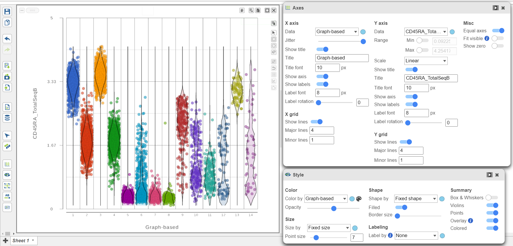
- Open the Style icon
- Switch on Violins under Summary
- Switch on Overlay under Summary
- Switch on Colored under Summary
- Color by Graph-based clusters under Color and use the slider to decrease the Opacity
- Open the Axes icon
- Change the X axis data to to Graph-based clusters
- Use the slider to increase the Jitter on the X axis (Figure 7)
...
| Numbered figure captions | ||||
|---|---|---|---|---|
| ||||
|
- Click the project name to return to the Analyses tab
...
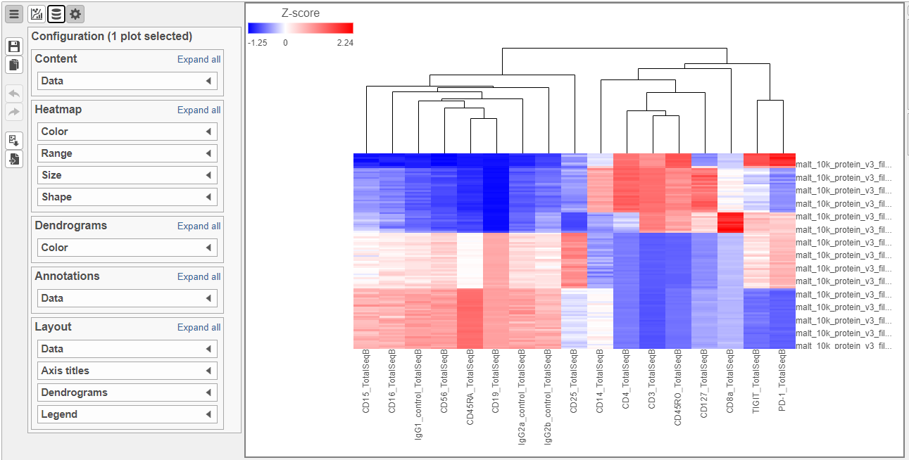
- Click the GSA data node
- Click Exploratory analysis in the toolbox
- Click Hierarchical clustering/heat mapheatmap
- In the Ordering section, choose Cell type from the Sample Graph-based clusters from the Cell order drop-down list
- Click Finish to run with the other default settings
- Double-click the Hierarchical clustering task node to open the heat map heatmap
The heatmap can easily be customized using the tools on the left.
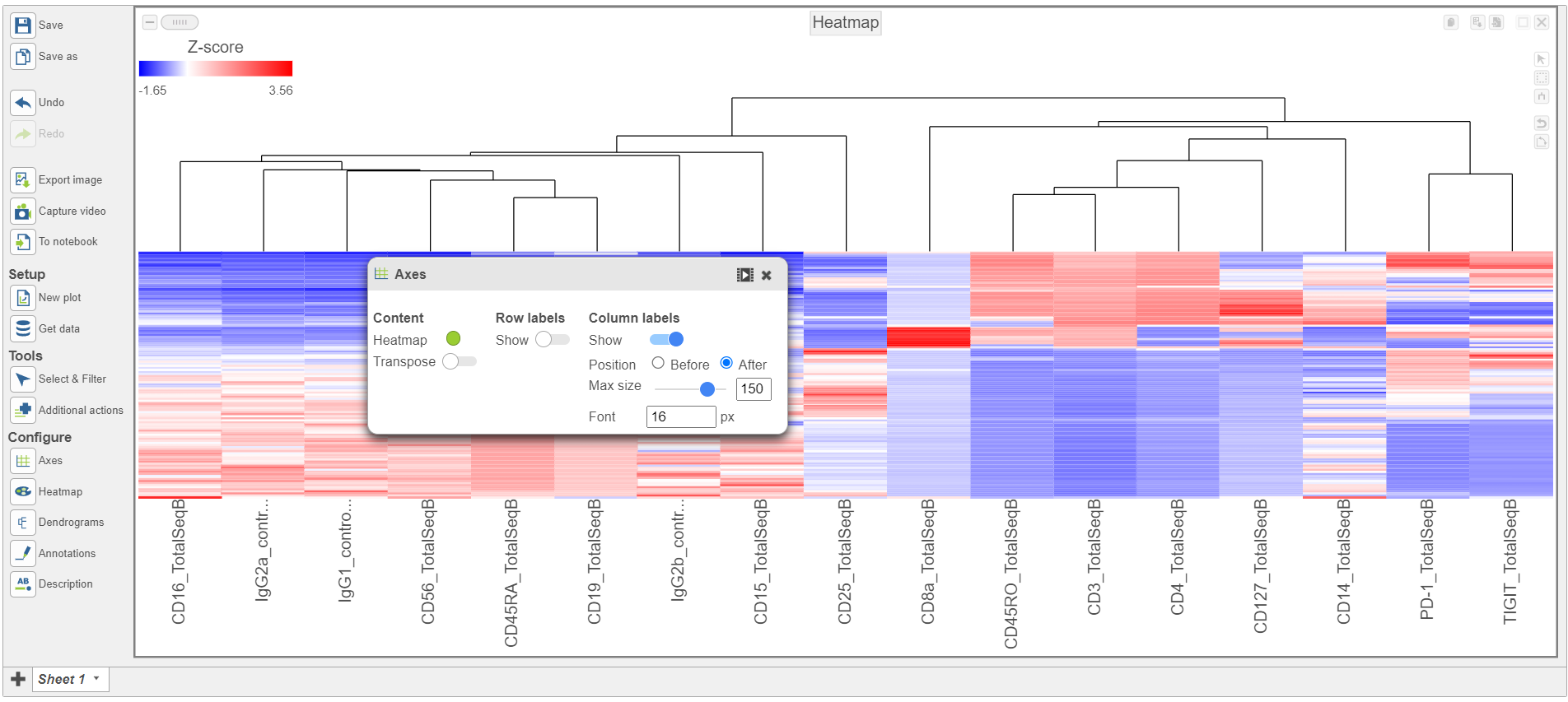
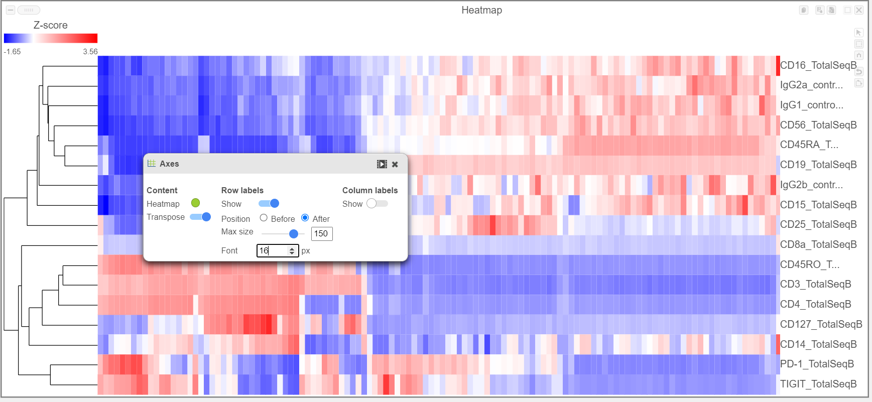
- Open the Axes icon
- Switch off Show Row labels
- Increase the Font to 16 (Figure 8)
| Numbered figure captions | ||||
|---|---|---|---|---|
| ||||
|
The heat map can easily be customized using the Configuration card on the left.
...
|
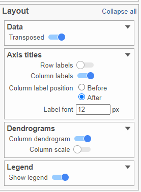
- Activate the Transpose switch which will switch the Row and Column labels, so now the Row labels will be shown (Figure 9)
| Numbered figure captions | ||||
|---|---|---|---|---|
| ||||
|
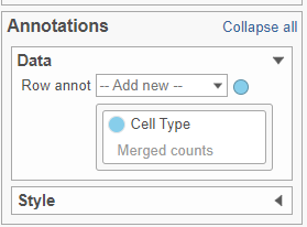
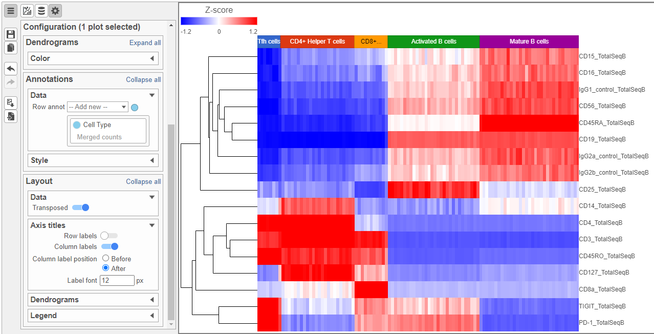
- In the Annotations section, expand the Data card
- Click the grey circle and choose Merged counts as the data source
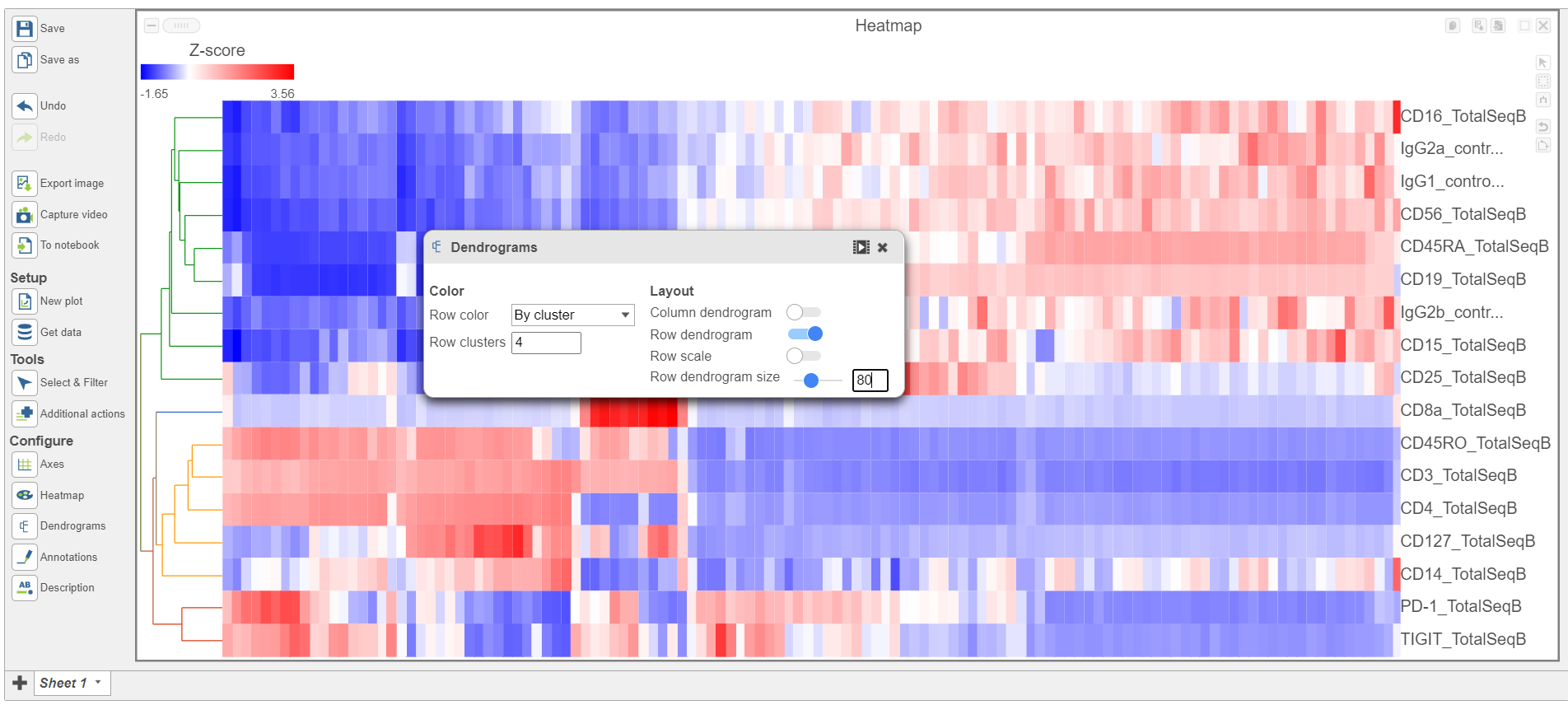
- Choose Cell type from the drop-down menu Open the Dendrograms icon
- Choose Row color By cluster and change Row clusters to 4
- Change Row dendrogram size to 80 (Figure 10)
| Numbered figure captions | ||||
|---|---|---|---|---|
| ||||
|
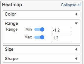
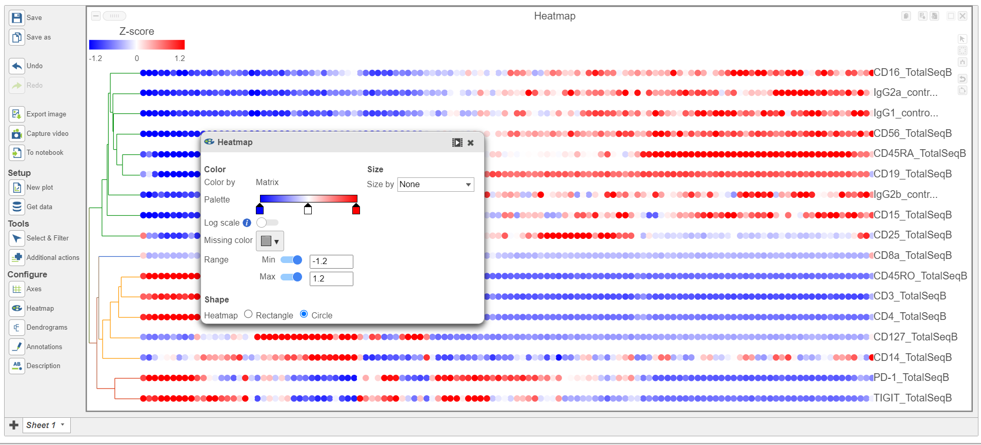
- In the Heatmap section, expand the Range card icon
- Navigate to Range under Color
- Set the Min and Max to -1.2 and 1.2, respectively
- Change the Shape to Circle (Figure 11)
| Numbered figure captions | ||||
|---|---|---|---|---|
| ||||
|
...
|
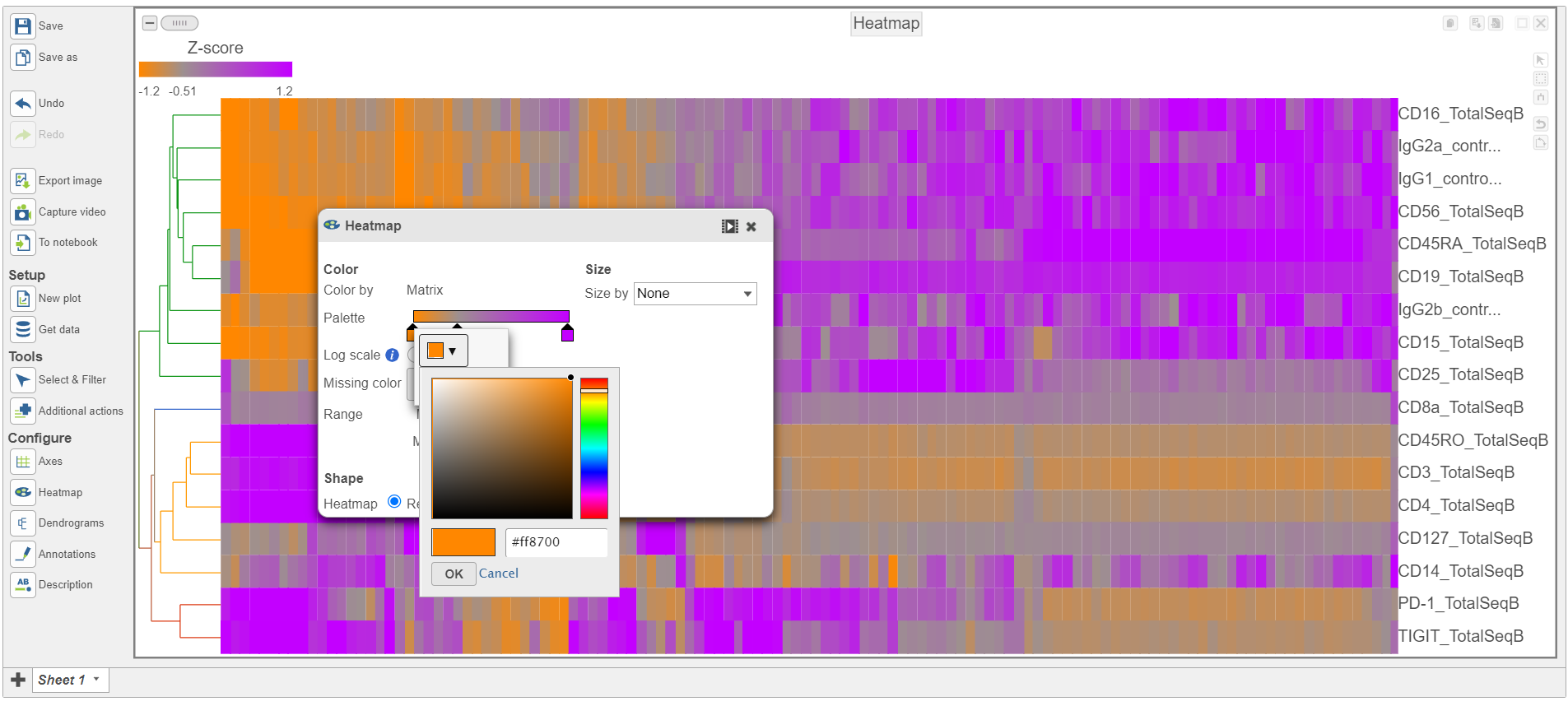
- Switch the Shape back to Rectangle
- Change the Color Palette by clicking on the color squares and selecting colors from the rainbow. Click outside of the selection box to exit this selection. The color options can be dragged alone the Palette to highlight value differences (Figure 12).
| Numbered figure captions | ||||
|---|---|---|---|---|
| ||||
| ||||
|
Feel free to explore the other tool options on the left to customize the plot further.
Differential Analysis, Visualization, and Pathway analysis - Gene Expression Data
...
Overview
Content Tools