Page History
...
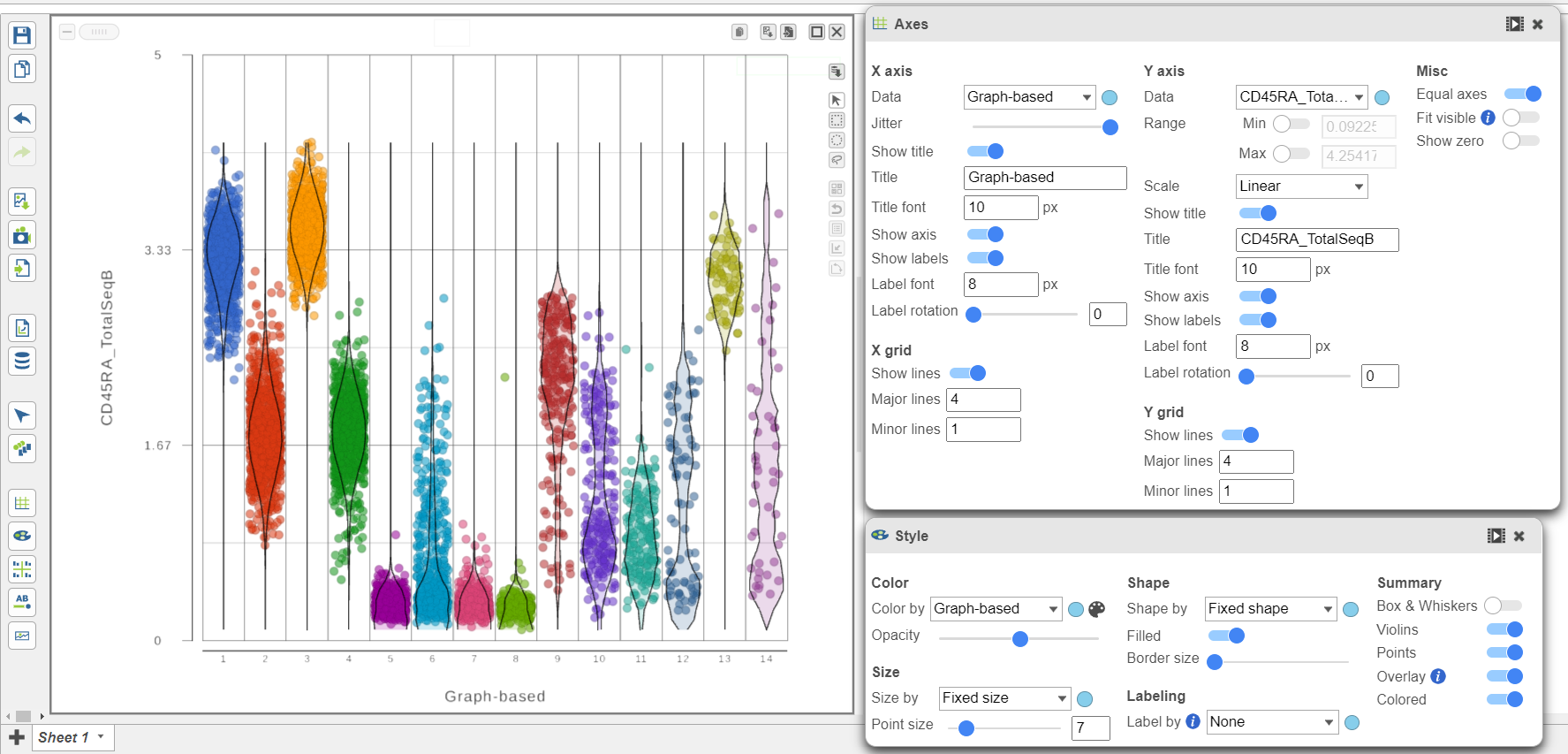
We can use the Configuration panel on the left to edit this plot.
- Expand Open the Summary card Style icon
- Switch on Violins under Summary
- Switch on Overlay Overlay under Summary
- Switch on Colored
- Expand the Data card
- Use the slider to increase the Jitter
- Expand the Color card
- Colored under Summary
- Color by Graph-based clusters under Color and use the slider to decrease the Opacity
- Open the Axes icon
- Change the X axis data to Graph-based clusters
- Use the slider to decrease the Opacity increase the Jitter on the X axis (Figure 7)
| Numbered figure captions | ||||
|---|---|---|---|---|
| ||||
|

- Click the project name to return to the Analyses tab
...
Overview
Content Tools