Page History
...
Partek distribute Gene Ontology (GO) for human and mouse genomes, a bioinformatics initiative to unify the representation of gene and gene product attributes across various species [1, 2].
| Numbered figure captions | ||||
|---|---|---|---|---|
| ||||
|
...
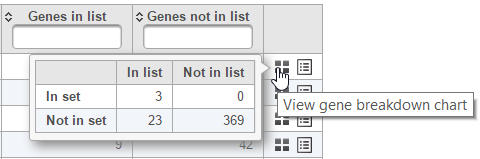
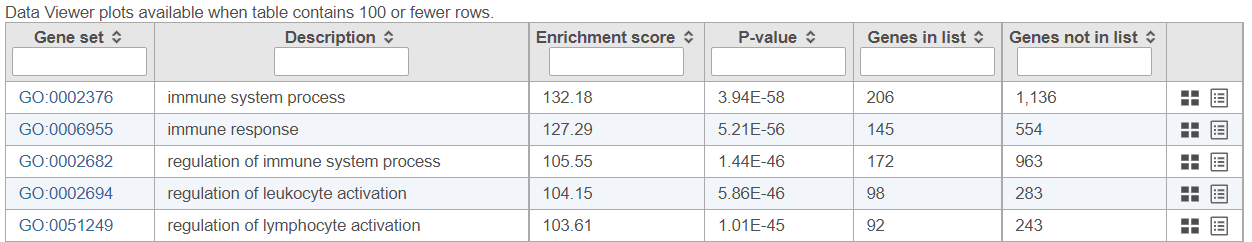
The contingency table (Figure 4) can be displayed by selecting the View gene breakdown chart icon on the right (![]() ). The term "list" refers to the list of significant genes, while the term "set" refers to the respective GO category. The first row of the contingency table is also seen in the report, namely the Genes in list and Genes not in list columns.
). The term "list" refers to the list of significant genes, while the term "set" refers to the respective GO category. The first row of the contingency table is also seen in the report, namely the Genes in list and Genes not in list columns.
| Numbered figure captions | ||||
|---|---|---|---|---|
| ||||
|
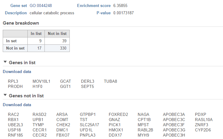
The View extra details (![]() ) button provides additional information on the GO category (Figure 5). In addition to the details already given in the report, a full list of Genes in list and Genes not in list can be inspected and downloaded (Download data) to the local computer as a text file.
) button provides additional information on the GO category (Figure 5). In addition to the details already given in the report, a full list of Genes in list and Genes not in list can be inspected and downloaded (Download data) to the local computer as a text file.
| Numbered figure captions | ||||
|---|---|---|---|---|
| ||||
|
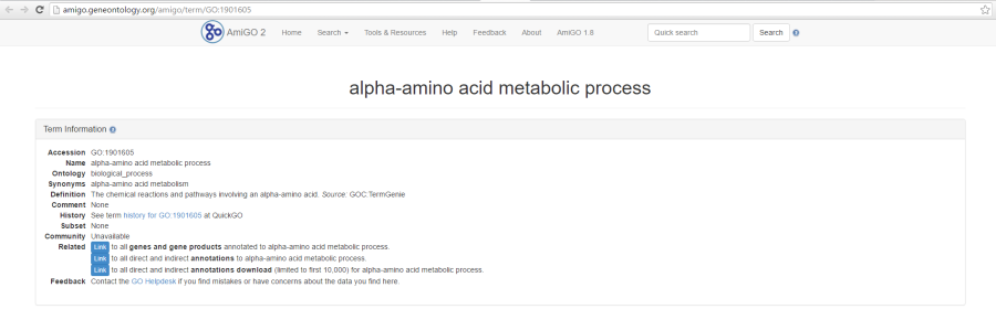
As previously mentioned, if you are using the GO gene sets distributed by Partek, the GO identifiers in the first column are hyperlinks to the Gene Ontology web-site entries (an example shown in Figure 6).
| Numbered figure captions | ||||
|---|---|---|---|---|
| ||||
|
...
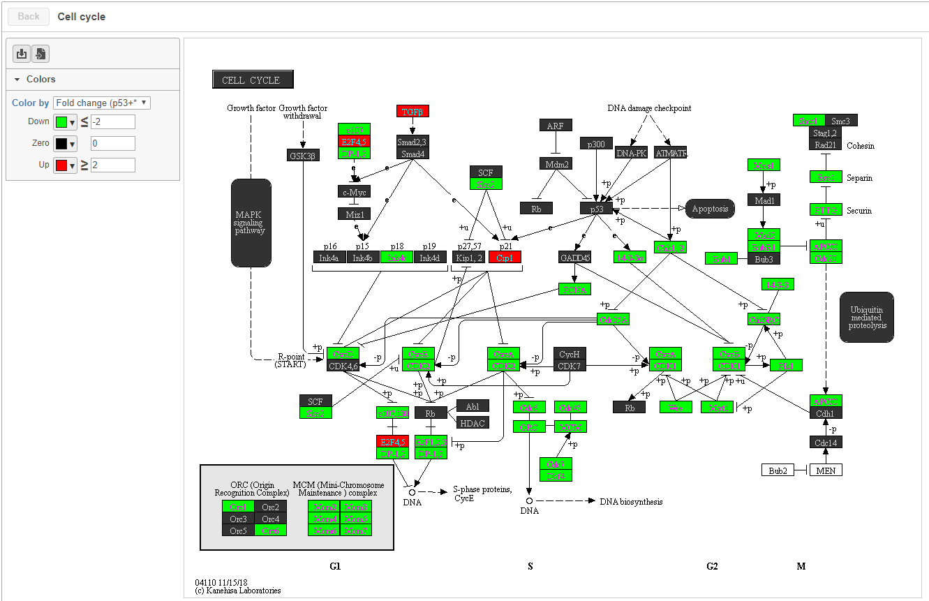
When KEGG database is used, on the enrichment task report, when click on a pathway ID in the Gene set column, a KEGG pathway gene network picture is displayed (Figure 7).
| Numbered figure captions | ||||
|---|---|---|---|---|
| ||||
|
...
- Fixed color: all genes are colored black.
- Genes in list: all genes in the list are colored, default color is yellow, but this can be configured. Genes not in the list are black.
- Statistics in the gene list: .e.g FDR, p-value, Fold change etc. Colors can be customized by clicking on the color square to change.
...
Feature details
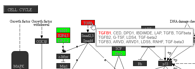
Mousing over a rectangle shows the genes indicated by the rectangle in the tooltip (Figure 8). Genes are listed on rows with all aliases in the KEGG database included on the row. Genes that are in the list are shown in bold. The gene being used to color the rectangle is shown in red.
| Numbered figure captions | ||||
|---|---|---|---|---|
| ||||
|
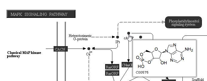
On KEGG pathway maps that include chemical compounds, the chemical structure is shown in the tooltip on mouse-over (Figure 109).
| Numbered figure captions | ||||
|---|---|---|---|---|
| ||||
|
...
If the gene set enrichment table has fewer than 100 results (rows), the GO categories can be visualized in the Data Viewer. Otherwise, a notification is displayed in the top left corner (Figure 1110).
| Numbered figure captions | ||||
|---|---|---|---|---|
| ||||
|
...
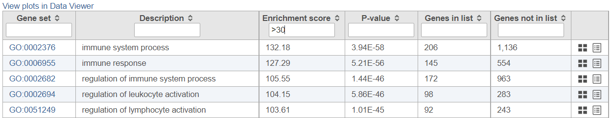
If needed, filter down the number results, for instance by using a cut-off based on the enrichment score. Type in the cut-off value in the text box beneath the Enrichment score and hit enter (an example is shown in Figure 1211). Once the number or results falls below 100, a link to the Data Viewer will be displayed (Figure 8). Click on the View plots in Data Viewer link to open a new Data Viewer session.
| Numbered figure captions | ||||
|---|---|---|---|---|
| ||||
|
...
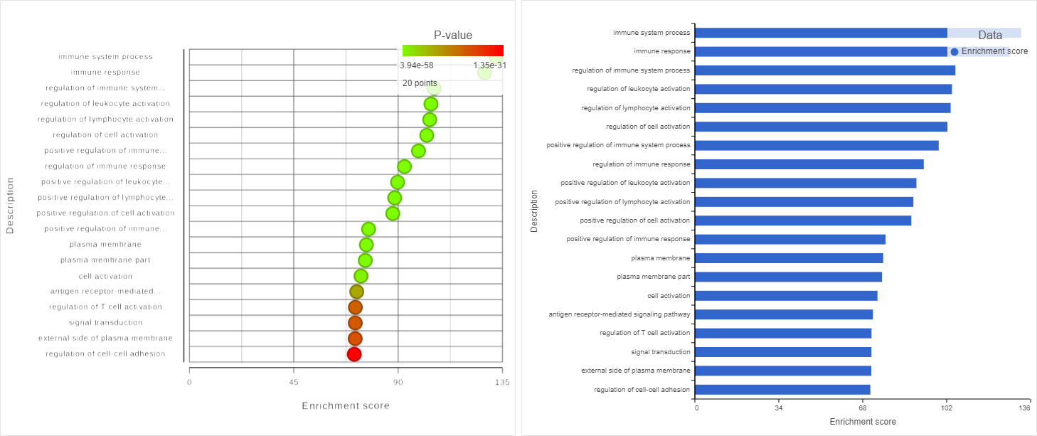
Two plots are loaded into Data Viewer (Figure 1312). Both plots show enrichment score on the horizontal axis and gene ontology categories (i.e. the ones present in the gene enrichment table) on the vertical axis. The plots show enrichments scores (Enrichment score column of the gene ontology table) and - in addition - the plot on the left uses color range to depict enrichment P-value (green = low, red = high P-value).
The same functionality is available for pathway enrichment results.
| Numbered figure captions | ||||
|---|---|---|---|---|
| ||||
|
...
Overview
Content Tools