Page History
...
| Numbered figure captions | ||||
|---|---|---|---|---|
| ||||
|
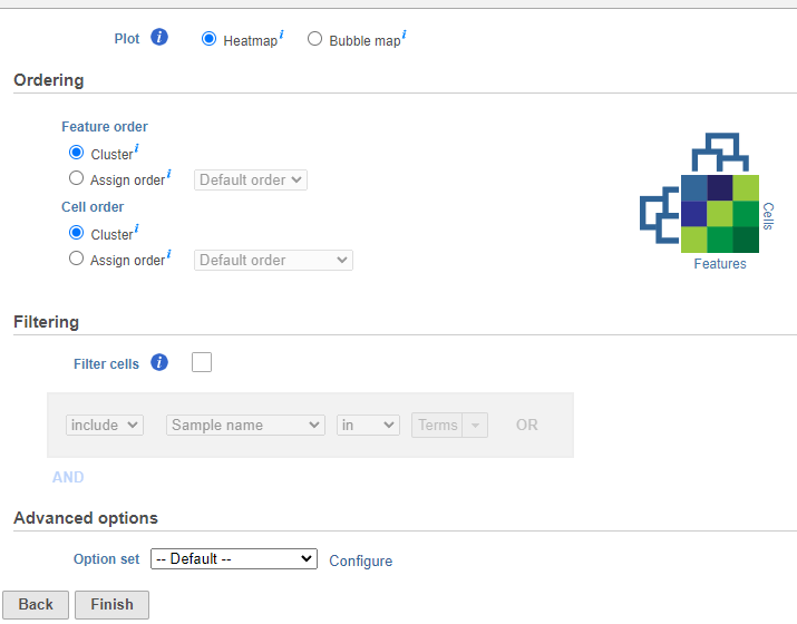
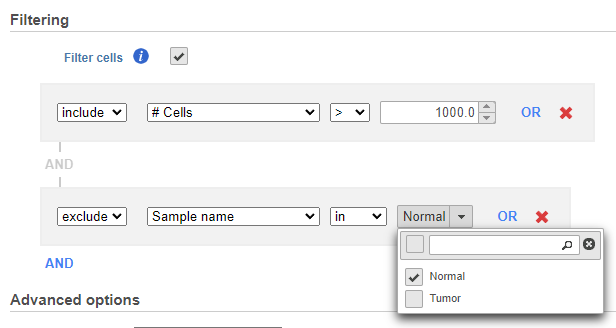
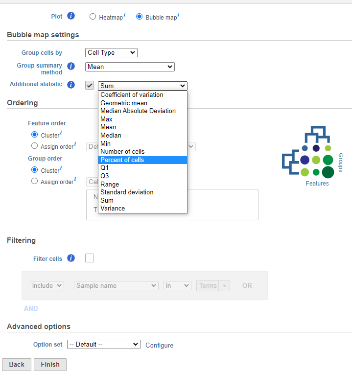
If you do not want to cluster all the samples, but select a subset based on a specific sample or cell attribute (i.e. group membership), check Filter cells under Filtering and set a filtering rule using the drop down lists (Figure 3). Notice the drop-down lists allow more than one factor (when available) to be selected at a time. When configuring the filtering rule, use AND to ensure all conditions pass for inclusion and use OR for any conditions to pass.
...
| Numbered figure captions | ||||
|---|---|---|---|---|
| ||||
|
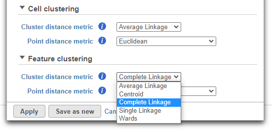
Hierarchical clustering uses distance metrics to sort based on similarity and is set to Average Linkage by default. This can be adjusted by clicking Configure under Advanced options (Figure 4).
...
| Numbered figure captions | ||||
|---|---|---|---|---|
| ||||
|
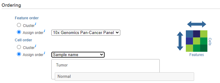
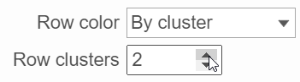
If the Cluster option is unchecked for Cells/Sample/Group order or Feature order, the Ordering option will be Assign order (Figure 5).
...
| Numbered figure captions | ||||
|---|---|---|---|---|
| ||||
|
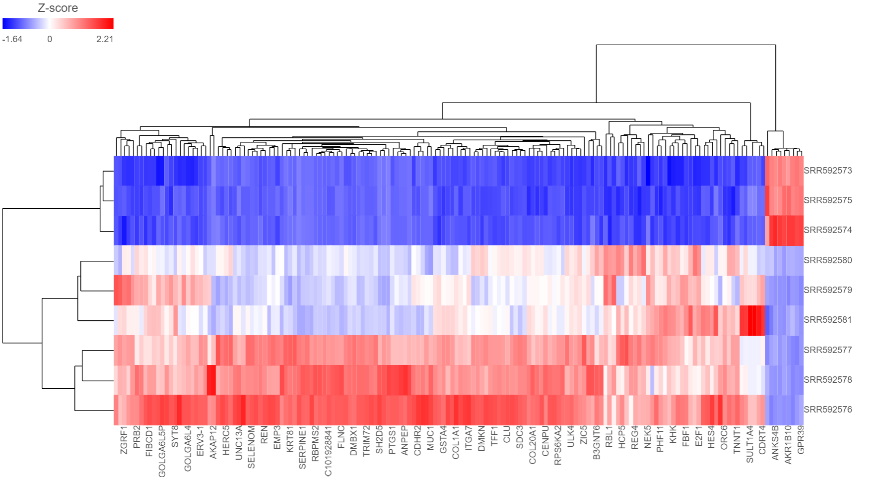
You can choose how the data is scaled (sometimes referred to as normalized). Navigate to Advanced options → Configure → Feature scaling, Standardize (default for a heatmap) will make each column mean as zero and standard deviation as 1 in all features. This is the default scaling for a heatmap and it makes all of the features (e.g., genes or proteins) have equal weight; standardized values are also known as Z-scores. The scaling mode Shift will make each column mean as zero. Choose None to not scale and perform clustering on the values in the quantified data node (this is the default for a bubble map). If a bubble map is scaled, scaling will be performed on the group summary method (color).
...
| Numbered figure captions | ||||
|---|---|---|---|---|
| ||||
|
Depending on the resolution of your screen and the number of samples and variables (features) that need to be displayed, some binning may be involved. If there are more samples/genes than pixels, values of neighboring rows/columns will be averaged together. Use the mouse wheel to zoom in and out. When you zoom in to certain level on the heatmap, you will see each cell represent one sample/gene. When you mouse over the row dendrogram or label area and zoom, it will only zoom in/out on the rows. The binning on the columns will remain the same. Similarly, when you mouse over the column dendrogram or label area and zoom, it will only zoom in/out on the columns. The binning on the rows will remain the same. To move the map around when zoomed in, press down the left mouse button and drag the map. The plot can be saved as a full-size image or as a current view; when Save image is clicked, a prompt will ask how you would like to save the image.
...
| Numbered figure captions | ||||
|---|---|---|---|---|
| ||||
 |
Configuration
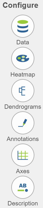
There are plot Configuration/Action options for the Hierarchical clustering / heat map task which apply to both the heatmap and bubble map in the Data viewer (Figure 8): Data, Heatmap, Dendrograms, Annotations, Axes, Description, and Additional actions. Click on the icon/widget under Configure or use direct manipulation on the plot itself to icon to open these configuration options.
| Numbered figure captions | ||||
|---|---|---|---|---|
| ||||

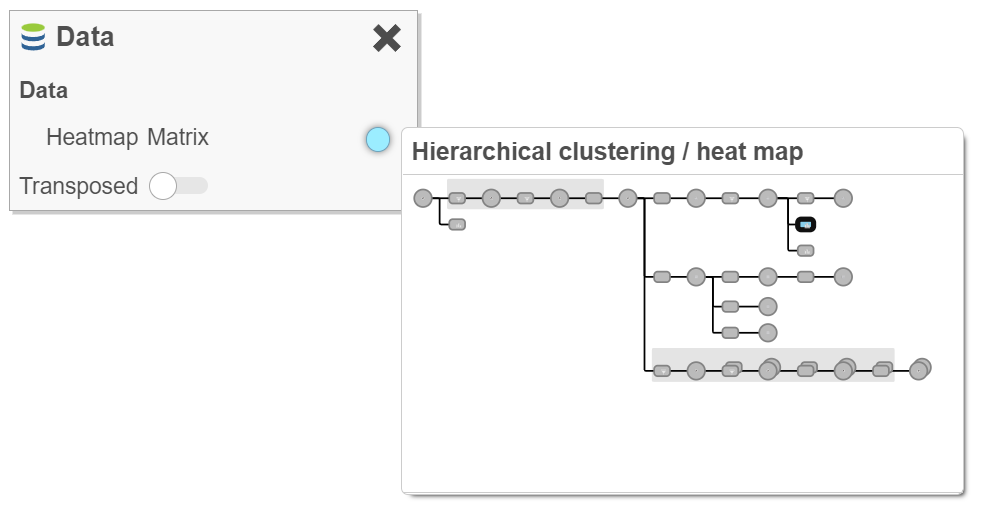
DataData 
This section controls the data source used to draw the values in the heatmap or bubble map and also the ability to transpose the axes. The plot is a color representation of the values in the selected matrix. Most of the data nodes contain only one matrix, so it will just say Matrix for the chosen data node (Figure 9). However, if a data node contains multiple matrices (e.g. descriptive statistics were performed on cluster groups for every gene like mean, standard deviation, percent of cells, etc) each statistic will be in a separate matrix in the output data node. In this case, you can choose which statistic/matrix to display using the drop-down list (this would be the case in a bubble map).
The Transposed toggle can be used to flip the axes To change the orientation (switch the columns and rows) of the plot, click on the (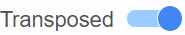 ) toggle switch.
| Numbered figure captions | ||||
|---|---|---|---|---|
| ||||
|

HeatmapHeatmap ![]()
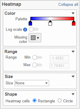
This section is used to configure the color, range, size, and shape of the components in the heatmap (Figure 10).
...
| Numbered figure captions | ||||
|---|---|---|---|---|
| ||||
|

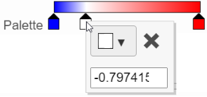
In the color palette horizontal bar, the left side color represents the lowest value and the right side color represents the highest value in the matrix data. Note that when you zoom in/out the lowest and highest values captured by the color palette may change. By default, there are 3 color stops (![]() ): minimum, middle, and maximum color value of the default range calculated on the matrix. Left-click on the middle color stop and drag left or right to change the middle value this color stop represents. If you left-click on the middle color stop once, you can change the color and value this color stop represents (Figure 11). Click on the (
): minimum, middle, and maximum color value of the default range calculated on the matrix. Left-click on the middle color stop and drag left or right to change the middle value this color stop represents. If you left-click on the middle color stop once, you can change the color and value this color stop represents (Figure 11). Click on the (![]() ) to remove this color stop.
) to remove this color stop.
| Numbered figure captions | ||||
|---|---|---|---|---|
| ||||
|
...
The shape of the heatmap cell (component) can be configured either as a rectangle or circle by selecting the radio button in the Shape card.
DendrogramsDendrograms 
If cluster analysis is performed on samples and/or features, the result will be displayed as dendrograms. By default, the dendrograms are all colored in black (Figure 6).
...
| Numbered figure captions | ||||
|---|---|---|---|---|
| ||||
|
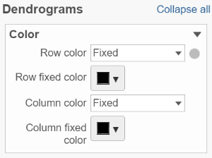

Click on the color square or its triangle (![]() ) to choose a different color for the dendrogram.
) to choose a different color for the dendrogram.
...
| Numbered figure captions | ||||
|---|---|---|---|---|
| ||||
|
AnnotationsAnnotations 
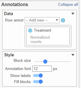
This section allows you to add sample or cell level annotations to the viewer. First, make sure to choose the correct data node which contains the annotation information you would like to use by clicking the circle (![]() ). All project level annotations will be available on all data nodes in the pipeline (Figure 17). Choose an attribute from the Row annot drop-down list. Multiple attributes can be chosen from the drop-down list and can be reordered by clicking and dragging the groups below the drop-down list. Each attribute is represented as an annotation bar next to the heatmap. Different colors represent the different groups in the attribute.
). All project level annotations will be available on all data nodes in the pipeline (Figure 17). Choose an attribute from the Row annot drop-down list. Multiple attributes can be chosen from the drop-down list and can be reordered by clicking and dragging the groups below the drop-down list. Each attribute is represented as an annotation bar next to the heatmap. Different colors represent the different groups in the attribute.
...
| Numbered figure captions | ||||
|---|---|---|---|---|
| ||||
|
...
|

The width of the annotation bar can be changed using the Block size slider when the Show labels toggle switch is on. The annotation label font size can be changed by specifying the size in pixels. The Fill blocks toggle switch adds or removes color from the annotation labels.
Layout
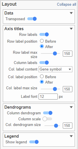
To change the orientation of the plot, click on the () toggle switch in the Data sub-section of the Layout section (Figure 18).
| Numbered figure captions | ||||
|---|---|---|---|---|
| ||||
|
...
Axes 
Axis titles can be turned on or off by clicking the relevant toggle switches. The axis label font size can be changed by specifying the number of pixels. If an Ensembl annotation model has been associated with the data, you can choose to display the gene name or the Ensembl ID using the Col. label content option (Figure 18).
| Numbered figure captions | ||||
|---|---|---|---|---|
| ||||
|

Description 
Description is used to toggle on or off the legend.
In-plot controls
The heatmap has several different mouse modes which modify the way the plot responds to the mouse buttons. The mode buttons are in the upper right corner of the heatmap. Clicking one of these buttons puts the heatmap into that mode.
...
| Numbered figure captions | ||||
|---|---|---|---|---|
| ||||
|
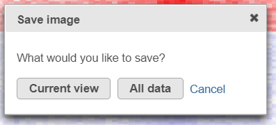
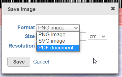
After selecting either Current view (if applicable) or All data button, the next dialog (Figure 20) will allow you to specify the image format, size, and resolution.
...
| Numbered figure captions | ||||
|---|---|---|---|---|
| ||||
|
| Additional assistance |
|---|
...
Overview
Content Tools