Page History
...
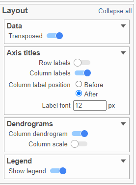
- In the Layout section, expand the Axis titles card
- Disable the Row labels
- Activate the Transpose switch (Figure ?Figure 9)
| Numbered figure captions | ||||
|---|---|---|---|---|
| ||||
|
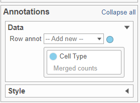
- In the Annotations section, expand the Data card
- Click the grey circle and choose Merged counts as the data source
- Choose Cell type from the drop-down menu (Figure ?Figure 10)
| Numbered figure captions | ||||
|---|---|---|---|---|
| ||||
|
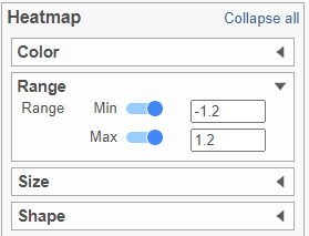
- In the Heatmap section, expand the Range card
- Set the Min and Max to -1.2 and 1.2, respectively (Figure ?Figure 11)
| Numbered figure captions | ||||
|---|---|---|---|---|
| ||||
|
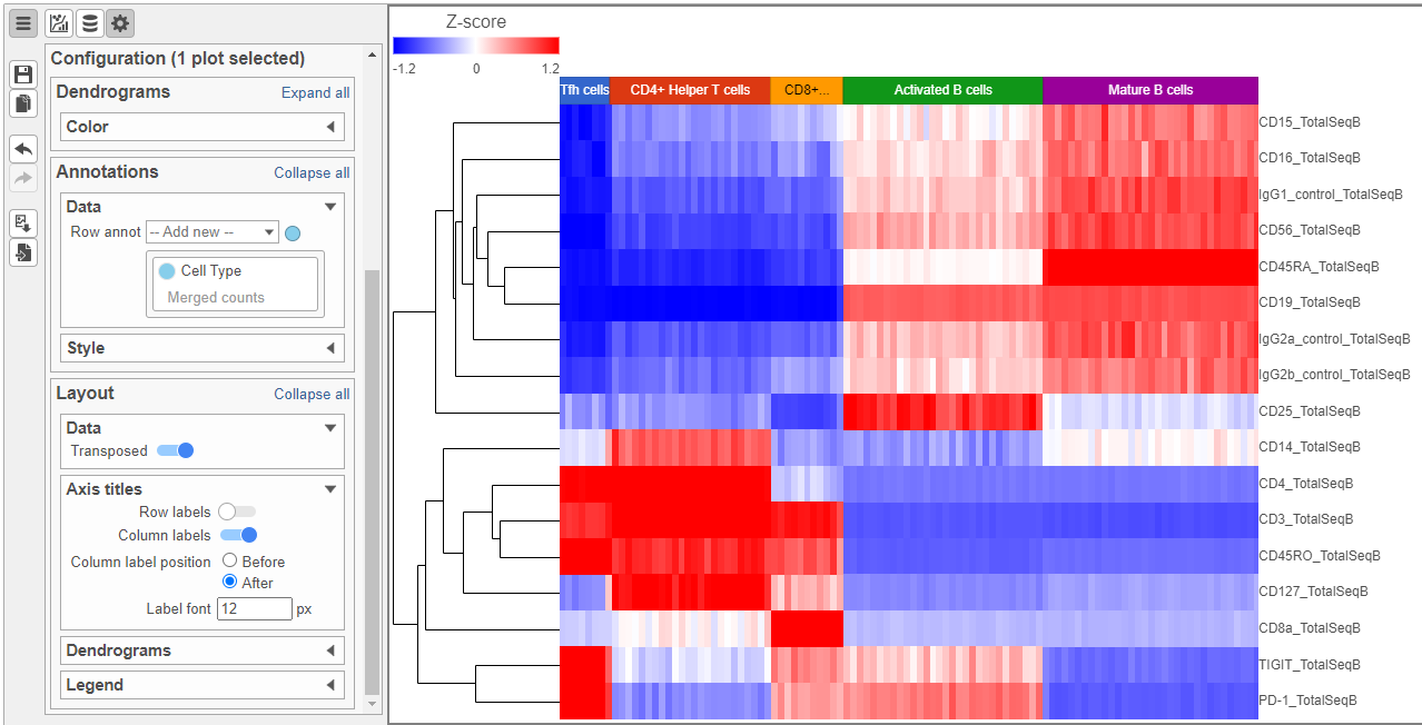
Feel free to explore the other options in the Configuration card on the left to customize the plot further (Figure ?Figure 12).
| Numbered figure captions | ||||
|---|---|---|---|---|
| ||||
|
...
- Double-click the GSA task node to open the task report (Figure 10Figure 13)
| Numbered figure captions | ||||
|---|---|---|---|---|
| ||||
|
...
The Volcano plot opens in a new data viewer session, in a new tab in the web browser. It shows each gene as a point with cutoff lines set for P-value (y-axis) and fold-change (x-axis). By default, the P-value cutoff is set to 0.05 and the fold-change cutoff is set at |2| (Figure 11Figure 14).
The plot can be configured using various options in the Configuration card on the left. For example, the Color, Size and Shape cards can be used to change the appearance of the points. The X and Y-axes can be changed in the Data card. The Significance card can be used to set different Fold-change and P-value thresholds for coloring up/down-regulated genes.
...
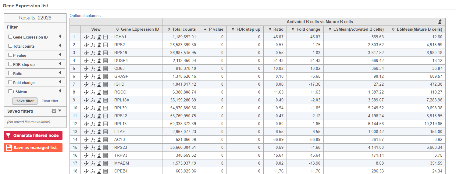
The number at the top of the filter will update to show the number of included genes (Figure 12Figure 15).
| Numbered figure captions | ||||
|---|---|---|---|---|
| ||||
|

...
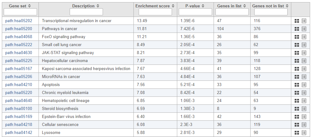
The pathway enrichment results list KEGG pathways, giving an enrichment score and p-value for each (Figure 13Figure 16).
| Numbered figure captions | ||||
|---|---|---|---|---|
| ||||
|
...
The KEGG pathway map shows up-regulated genes from the input list in red and down-regulated genes from the input list in green (Figure 1417).
| Numbered figure captions | ||||
|---|---|---|---|---|
| ||||
|
...
Overview
Content Tools