Page History
...
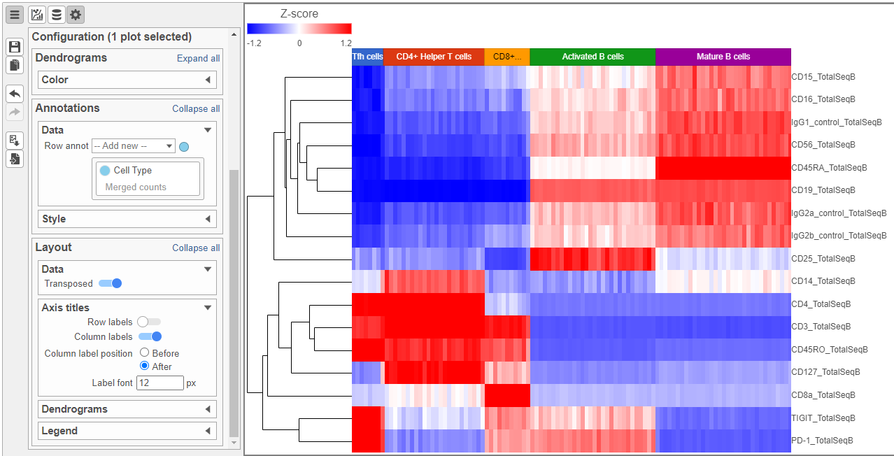
The heat map can easily be customized to illustrate our results.
...
using the Configuration card on the left.
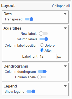
- In the Layout section, expand the Axis titles card
- Disable the Row labels
- Activate the Transpose switch (Figure ?)
| Numbered figure captions | ||||
|---|---|---|---|---|
| ||||
|
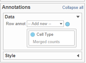
- In the Annotations section, expand the Data card
- Click the grey circle and choose Merged counts as the data source
- Choose Cell type from the drop-down menu (Figure ?)
| Numbered figure captions | ||||
|---|---|---|---|---|
| ||||
|
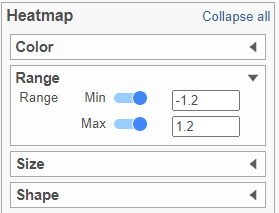
- In the Heatmap section, expand the Range card
- Set the Min and Max to -1.2 and 1.2, respectively (Figure ?)
| Numbered figure captions | ||||
|---|---|---|---|---|
| ||||
|
Feel free to explore the other options in the Configuration card on the left to customize the plot further (Figure ?).
| Numbered figure captions | ||||
|---|---|---|---|---|
| ||||
|
...
Overview
Content Tools