Page History
...
The hierarchical clustering setup dialog (Figure 2) enables you to control the clustering algorithm. Starting from the top, you can choose to Cluster samples, Cluster features (genes/transcripts) or both. By default, if there are less than 3000 samples, the Cluster samples check button is selected, if there are less than 3000 features, the Cluster features check button is selected. Otherwise the check button is de-selected.
...
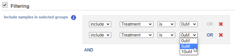
If you do not want to cluster all the samples, but select a subset based on specific sample attributes (i.e. group membership), use the Filtering drop down list (Figure 3). The default value of the Filtering option is All samples.
| Numbered figure captions | ||||
|---|---|---|---|---|
| ||||
|
You can choose to how the data is normalized. Under the Normalization mode dropdown, Standardize (default) will make each column mean as zero and standard deviation as 1 in all features. This is the default normalization and it makes makes all the features (e.g., genes) have equal weight. The normalization mode Shift will make each column mean as zero. Choose None to perform clustering on the values in the quantified data node.
| Numbered figure captions | ||||
|---|---|---|---|---|
| ||||
|
Heat Map
The output of a Hierarchical clustering task is a heat map (Figure 4) with or without dendrogram depends on whether you perform cluster on samples/cells or features. By default, samples are on rows (sample labels are displayed as seen in the Data tab) and features (genes or transcripts, depending on the input data) on columns. Colors are based on standardized expression values (default selection; performed on the fly), Dendrograms show clustering of rows (samples) and columns (variables).
...
| Numbered figure captions | ||||
|---|---|---|---|---|
| ||||
|
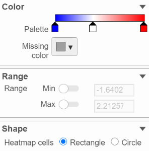
In the color palette horizonal horizontal bar, left side color represent low value, right side color represent high value in the matrix data represented. By default, there are 3 tabs (![]() ) present the min, middle and max color value of default range calculated on the matrix. Left click on the middle tab and drag left/right can change the middle the value of this tab representedrepresents. When left click on the middle tab and release the mouse, you can change the color and value of this tab represents ((Figure 9). Click on (
) present the min, middle and max color value of default range calculated on the matrix. Left click on the middle tab and drag left/right can change the middle the value of this tab representedrepresents. When left click on the middle tab and release the mouse, you can change the color and value of this tab represents ((Figure 9). Click on (![]() ) to remove this tab.
) to remove this tab.
...
Overview
Content Tools