Page History
...
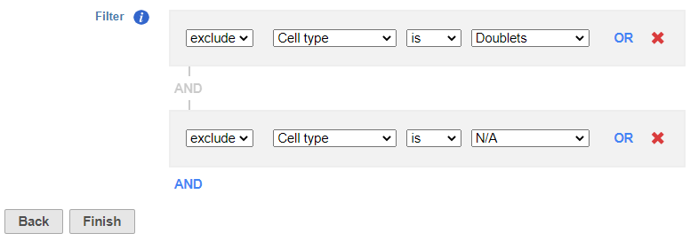
- Click the Classified result data node
- Click Filtering
- Click Filter groups
- Set to exclude Cell type is Doublets using the drop-down menus
- Click AND
- Set the second filter to exclude Cell type is N/A using the drop-down menus
- Click Finish to apply the filter (Figure ?1)
| Numbered figure captions | ||||
|---|---|---|---|---|
| ||||
|
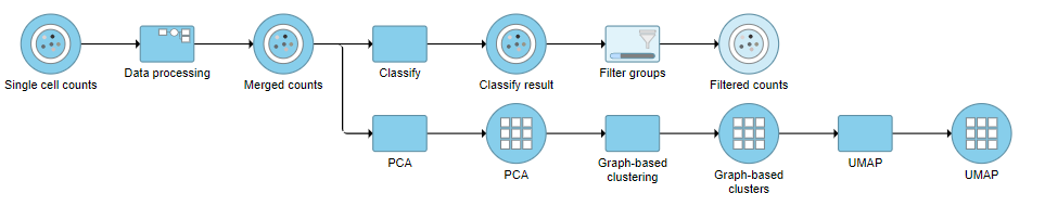
This produces a Filtered counts data node (Figure ?2).
| Numbered figure captions | ||||
|---|---|---|---|---|
| ||||
|
...
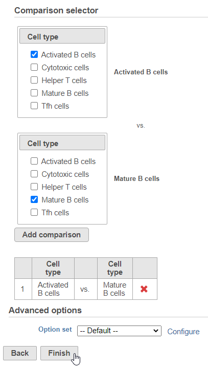
This will produce two data nodes, one for each data type (Figure ?3). The split data nodes will both retain cell classification information.
...
- Click Finish to run the statistical test (Figure ?4)
| Numbered figure captions | ||||
|---|---|---|---|---|
| ||||
|
...
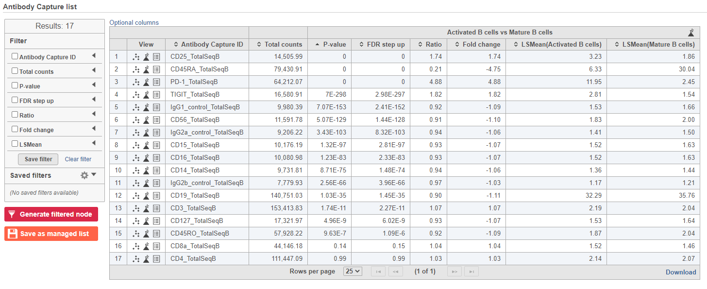
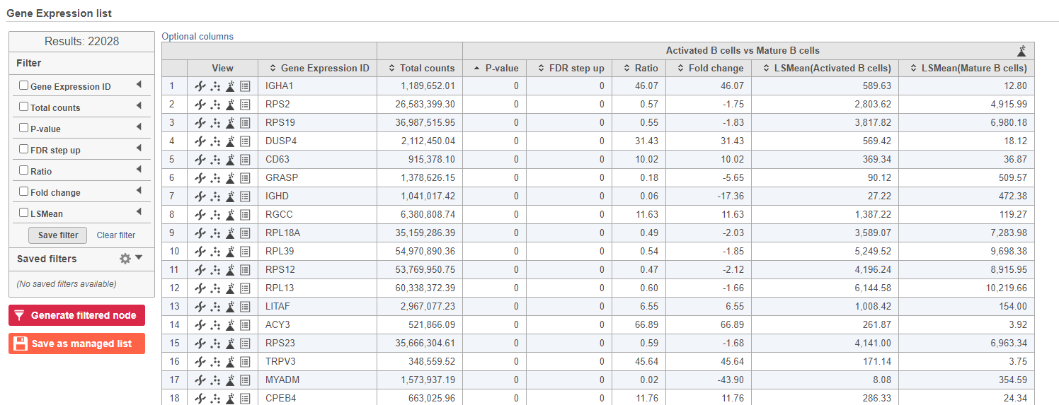
The report lists each feature tested, giving p-value, false discovery rate adjusted p-value (FDR step up), and fold change values for each comparison (Figure ?5).
| Numbered figure captions | ||||
|---|---|---|---|---|
| ||||
|
...
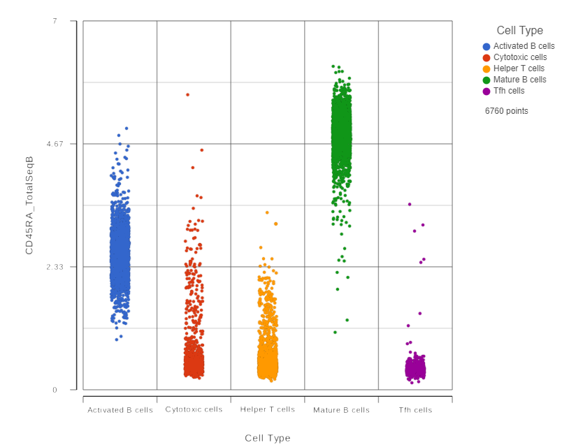
This opens a dot plot in a new data viewer session, showing CD45A expression for cells in each of the classifications (Figure ?6).
| Numbered figure captions | ||||
|---|---|---|---|---|
| ||||
|
...
- Expand the Summary card
- Switch on Violins
- Switch on Overlay
- Switch on Colored
- Expand the Data card
- Use the slider to increase the Jitter
- Expand the Color card
- Use the slider to decrease the Opacity (Figure ?7)
| Numbered figure captions | ||||
|---|---|---|---|---|
| ||||
|

...
- Click the GSA data node
- Click Exploratory analysis in the toolbox
- Click Hierarchical clustering/heat map
- Check Samples at the top to cluster the cells in addition to features
- Click Finish to run with other default settings
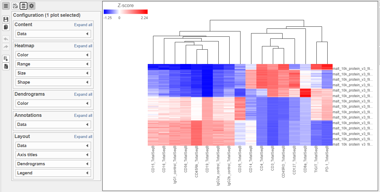
- Double-click the Hierarchical clustering task node to open the heat map (Figure ?8)
| Numbered figure captions | ||||
|---|---|---|---|---|
| ||||
|
...
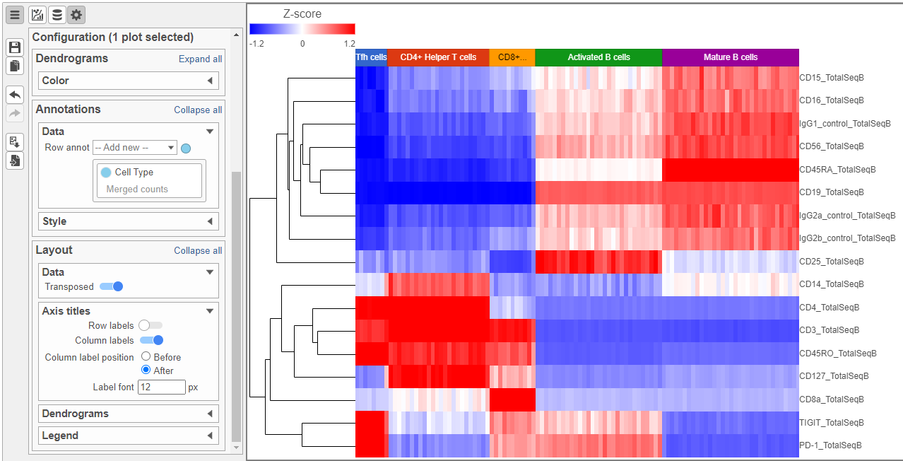
- Click
 to transpose the heat map
 - Set High to 2.6 to match the low range
- Set the Sample dendrogram to By sample attribute Cell type
- Set Attributes to Cell type
- Click
 and set Rotation to 0
 - Uncheck Samples under Show labels (Figure 9)
| Numbered figure captions | ||||
|---|---|---|---|---|
| ||||
|
...
- Double-click the GSA task node to open the task report (Figure ?10)
| Numbered figure captions | ||||
|---|---|---|---|---|
| ||||
|
...
The Volcano plot opens in a new data viewer session, in a new tab in the web browser. It shows each gene as a point with cutoff lines set for P-value (y-axis) and fold-change (x-axis). By default, the P-value cutoff is set to 0.05 and the fold-change cutoff is set at |2| (Figure ?11).
The plot can be configured using various options in the Configuration card on the left. For example, the Color, Size and Shape cards can be used to change the appearance of the points. The X and Y-axes can be changed in the Data card. The Significance card can be used to set different Fold-change and P-value thresholds for coloring up/down-regulated genes.
...
The number at the top of the filter will update to show the number of included genes (Figure ?12).
| Numbered figure captions | ||||
|---|---|---|---|---|
| ||||
|

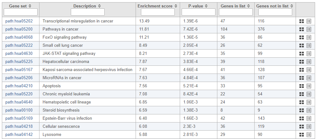
...
The pathway enrichment results list KEGG pathways, giving an enrichment score and p-value for each (Figure ?13).
| Numbered figure captions | ||||
|---|---|---|---|---|
| ||||
|
...
The KEGG pathway map shows up-regulated genes from the input list in red and down-regulated genes from the input list in green (Figure ?14).
| Numbered figure captions | ||||
|---|---|---|---|---|
| ||||
|
...
Overview
Content Tools