Page History
...
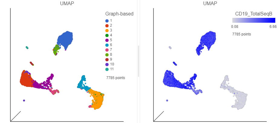
- In the Data card on the left, click Merged counts
- Scroll down and find the CD19_TotalSeqB protein marker
- Click and drag the CD19_TotalSeqB marker and click and drag it over to the UMAP plot on the right
- Drop the CD19_TotalSeqB marker over the Color configuration option on the plot
...
| Numbered figure captions | ||||
|---|---|---|---|---|
| ||||
|
- Click
 in the top right corner of the UMAP plot
 - Lasso around the CD19 positive cells (Figure ?)
- Click
in the Filtering card on the right to include the selected points
...
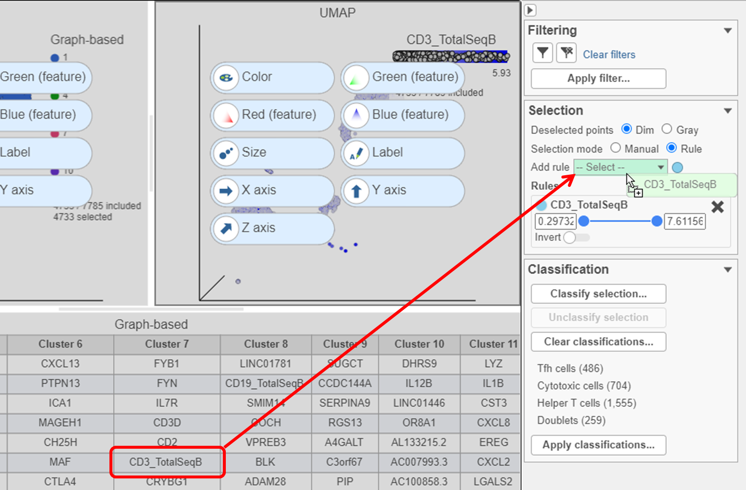
- Click
- Find the CD3_TotalSeqB protein marker in the biomarker table
- Click and drag CD3_TotalSeqB onto the Add rule drop-down list in the Selection card (Figure ?)
| Numbered figure captions | ||||
|---|---|---|---|---|
| ||||
|
...
The remaining CD3 positive cells have been added to the Doublet classification and removed from the plot.
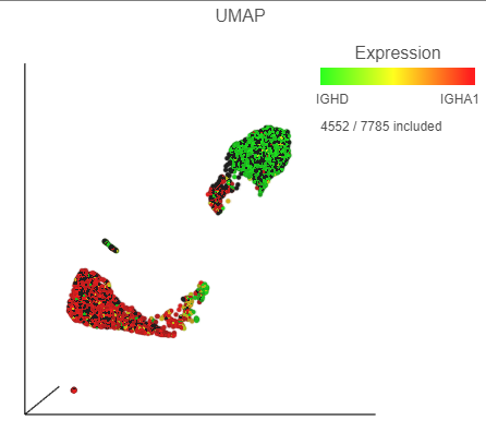
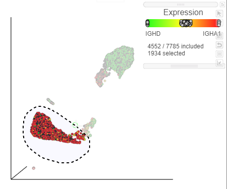
The biomarkers for clusters 1 and 2 also show an interesting pattern. Cluster 1 lists IGHD as its top biomarker, while cluster 2 lists IGHA1. Both IGHD (Immunoglobulin Heavy Constant Delta) and IGHA1 (Immunoglobulin Heavy Constant Alpha 1) encode classes of the immunoglobulin heavy chain constant region. IGHD is part of IgD, which is expressed by mature B cells, and IGHA1 is part of IgA1, which is expressed by activated B cells. We can color the plot by both of these genes to visualize their expression.
- Click, drag and drop IGHD from the biomarker table onto the Green (feature) configuration option on the UMAP plot on the right
- Click, drag and drop IGHA1 from the biomarker table onto the Red (feature) configuration option on the UMAP plot on the right
| Numbered figure captions | ||||
|---|---|---|---|---|
| ||||
|
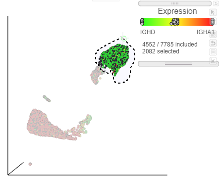
We can use the lasso tool to select and classify these populations.
- Click
 in the top right corner of the UMAP plot
 - Lasso around the IGHD positive cells (Figure ?)
- In the Classification card on the right, click Classify selection
- Label the cells as Mature B cells
- Click Save
| Numbered figure captions | ||||
|---|---|---|---|---|
| ||||
|
- Lasso around the IGHA1 positive cells (Figure ?)
- In the Classification card on the right, click Classify selection
- Label the cells as Activated B cells
- Click Save
| Numbered figure captions | ||||
|---|---|---|---|---|
| ||||
|
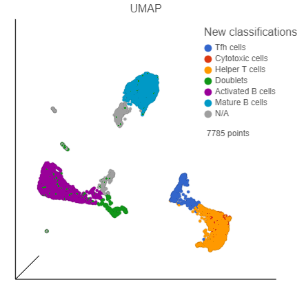
We can now visualize our classifications.
- Click the Clear filters link in the Filtering card on the right
- Select the duplicate UMAP plot (with the cell colored by marker genes)
- In the Configuration card on the left, expand the Color card and color the cells by New classification
| Numbered figure captions | ||||
|---|---|---|---|---|
| ||||
|
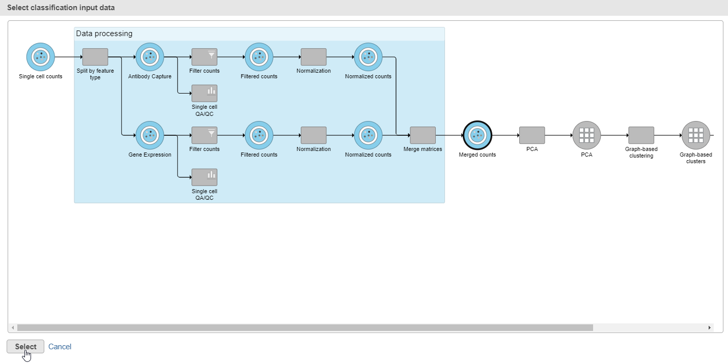
- Click Apply classifications in the Classification card on the right
- Choose the Merged counts data node as input for the classification task (Figure ?)
| Numbered figure captions | ||||
|---|---|---|---|---|
| ||||
|
- Click Select
- Name the attribute Cell type
- Click Run
- Click OK to close the message about a classification task being enqueued
Optionally, you may wish to save this data viewer session if you need to go back and reclassify cells later. To save the session, click the icon on the left and name the session.
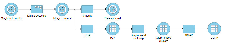
A Classify task will be added to the pipeline producing a Classify results data node.
- Click the project name at the top to go back to the Analyses tab (Figure ?)
| Numbered figure captions | ||||
|---|---|---|---|---|
| ||||
|
| Page Turner | ||
|---|---|---|
|
| Additional assistance |
|---|
| Rate Macro | ||
|---|---|---|
|
...
Overview
Content Tools