Join us for an event September 26!
How to Streamline RNA-Seq analysis and increase productivity—point, click, and done
Page History
...
| Numbered figure captions | ||||
|---|---|---|---|---|
| ||||
|
- Click
to in Filtering card on the right to include the selected points
- Click
 in the top right of the plot to switch back to pointer mode
 - Click and drag the plot to rotate it around
...
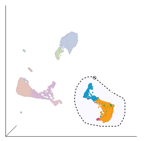
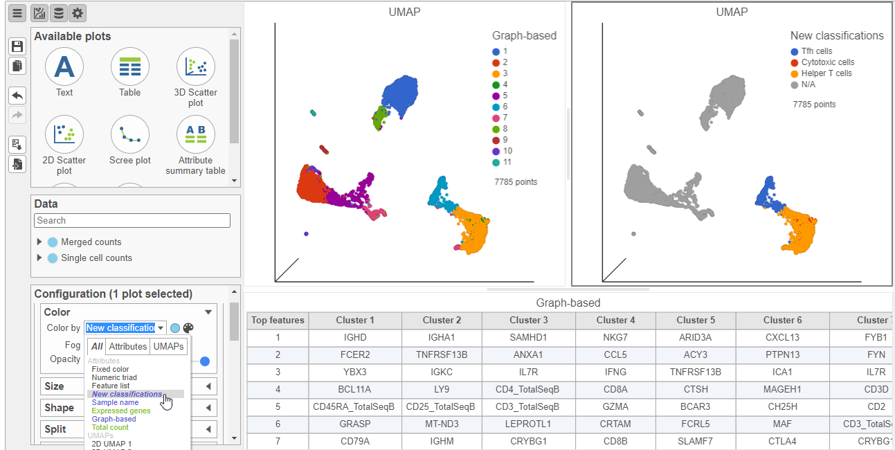
This group of putative T cells predominantly consists of cells assigned to graph-based clusters 3, 4, 6, and 7, indicated by the colors. Examining the biomarker table for these clusters can help us infer different types of T cell types.
- Click and drag the bar between the UMAP plot and the biomarker table to resize the biomarker table to see more of it (Figure ?)
...
| Numbered figure captions | ||||
|---|---|---|---|---|
| ||||
|
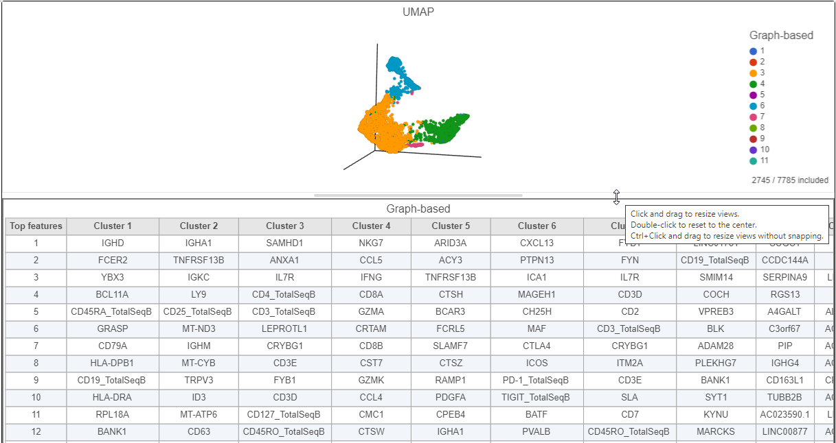
Cluster 6 has several interesting biomarkers. The top biomarker is CXCL13, a gene expressed by follicular B helper T cells (Tfh cells). Two of the other biomarkers are PD-1 protein, which is expressed in Tfh cells. This protein promotes self-tolerance and is a target for immunotherapy drugs. The TIGIT protein is also expressed in cluster 8 and is another immunotherapy drug target that promotes self-tolerance.
Cluster 4 expresses several marker genes associated with cytotoxicity (e.g. NKG7, CCL5, and GZMA) and the CD8 protein. Thus, these are likely to be cytotoxic cells.
We can visually confirm these expression patterns and assess the specificity of these markers by coloring the cells on the UMAP plot based on their expression of these markers.
- Click the duplicate plot icon above the UMAP plot
We color the cells on the duplicate by their expression of marker genes, while keeping the original plot colored by graph-based cluster assignment.
- Click and drag the CXCL13 gene from the biomarker table onto the duplicate UMAP plot
- Drop the CXCL13 gene onto the Green (feature) option (Figure ?)
| Numbered figure captions | ||||
|---|---|---|---|---|
| ||||
|
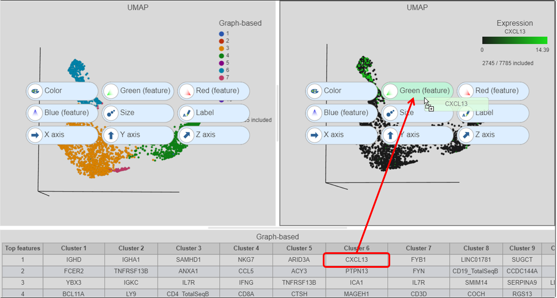
- Click and drag the NKG7 gene from the biomarker table onto the duplicate UMAP plot
- Drop the NKG7 gene onto the Red (feature) option
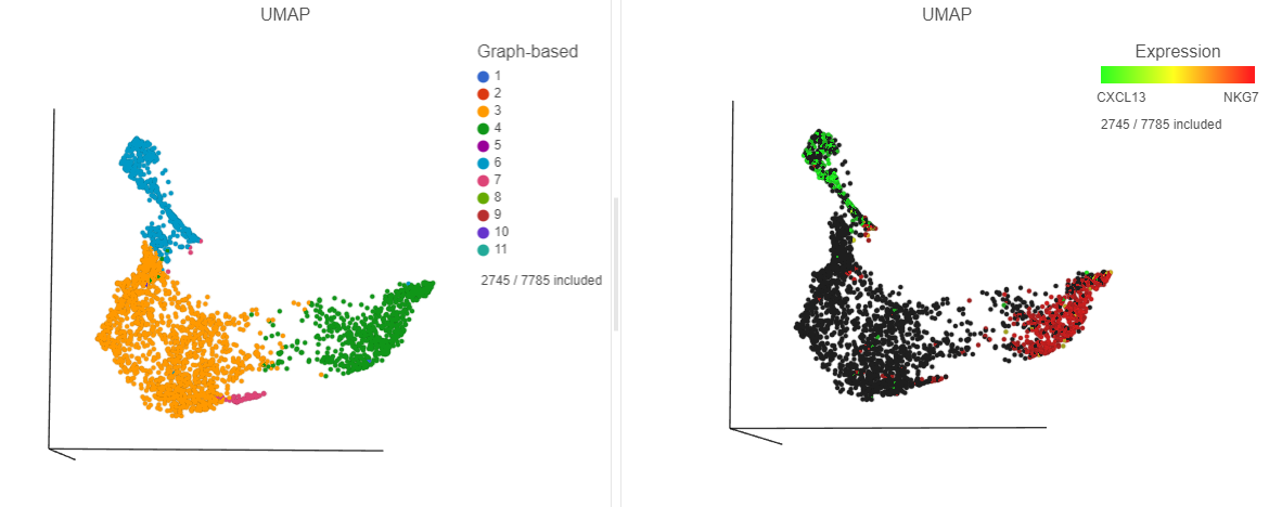
The cells with higher CXCL13 and NKG7 expression are now colored green and red, respectively. By looking at the two UMAP plots side by side, you can see these two marker genes are localized in graph-based clusters 6 and 4, respectively (Figure ?).
| Numbered figure captions | ||||
|---|---|---|---|---|
| ||||
|
- In the Selection card on the right, click
- Click the blue circle next to the Add rule drop-down list
- Search for Graph to search for a data source
- Select Graph-based clustering
- Click the Add rule drop-down list and choose Graph-based to add a selection rule (Figure ?)
| Numbered figure captions | ||||
|---|---|---|---|---|
| ||||
|
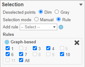
- In the Graph-based filtering rule, click All to deselect all cells
- Click cluster 6 to select all cells in cluster 6
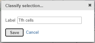
- In the Classification card on the right, click Classify selection
- Label the cells as Tfh cells (Figure ?)
- Click Save
| Numbered figure captions | ||||
|---|---|---|---|---|
| ||||
|
- Click
 in the Filtering card on the right to exclude the cluster 6/Tfh cells
 - Click cluster 4 to select all cells in cluster 4
- In the Classification card on the right, click Classify selection
- Label the cells as Cytotoxic cells
- Click Save
- Click in the Filtering card on the right to exclude the cluster 4/Cytotoxic cells
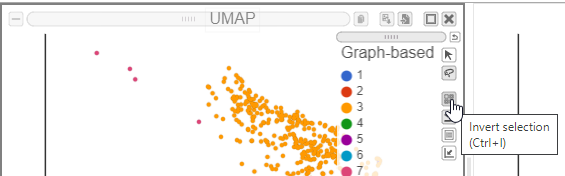
We can classify the remaining cells as helper T-cells, as they predominantly express the CD4 protein marker.
- Click on the invert selection icon in either of the UMAP plots (Figure ?)
| Numbered figure captions | ||||
|---|---|---|---|---|
| ||||
|
- In the Classification card on the right, click Classify selection
- Label the cells as Helper T cells
- Click Save
Let's look at our progress so far, before we classify subsets of B-cells.
- Click the Clear filters link in the Filtering card on the right
- Select the duplicate UMAP plot (with the cell colored by marker genes)
- In the Configuration card on the left, expand the Color card and color the cells by New classification
| Numbered figure captions | ||||
|---|---|---|---|---|
| ||||
|
B cells
In addition to T-cells, we would expect to see B lymphocytes, at least some of which are malignant, in a MALT tumor sample. We can color the plot by expression of a B cell marker to locate these cells on the UMAP plot.
- In the Data card on the left, click Merged counts
- Scroll down and find the CD19_TotalSeqB protein marker
- Click the CD19_TotalSeqB marker and click and drag it over to the UMAP plot on the right
- Drop the CD19_TotalSeqB marker over the Color configuration option on the plot
The cells in the UMAP plot are now colored from grey to blue according to their expression level for the CD19 protein marker (Figure ?). The CD19 positive cells correspond to several graph-based clusters. We can filter to these cells to examine them more closely,
| Numbered figure captions | ||||
|---|---|---|---|---|
| ||||
| Additional assistance |
|---|
| Rate Macro | ||
|---|---|---|
|
...
Overview
Content Tools