Page History
| Table of Contents | ||||||
|---|---|---|---|---|---|---|
|
Sort rows by prototype is a function that can identify genes with similar expression patterns. For example, if a gene with an interesting expression pattern has been detected, using Sort by prototype makes it possible to find other genes that have a similar pattern of intensity values. Although this is most commonly used for changes in gene expression over a time course, it can be applied to other experimental designs as well.
To invoke Sort rows by prototype, probe(sets)/genes must be on rows. If you want to use this tool to analyze the main intensity values spreadsheet, the spreadsheet must be transposed prior to analysis. A common way to view and analyze gene expression in a time-series experiment is to include means or LS means in the ANOVA spreadsheet.
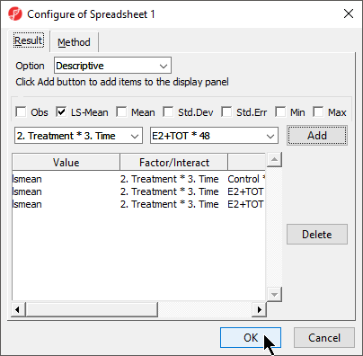
- Configure the ANOVA dialog to include the factor or interaction of interest
- Select Advanced... from the ANOVA dialog
- Use the drop down menus to select the factors or interaction you want the LS mean / mean of
- Select Add for each
- Select OK (Figure 1)
| Numbered figure captions | ||||
|---|---|---|---|---|
| ||||
|
- Select OK to close the ANOVA configuration dialog and open the ANOVA spreadsheet
The Sort rows by prototype function uses every non-text column in a spreadsheet to build and compare patterns; any columns you do not want to include the pattern similarity analysis need to be removed before running the function.
If you want to preserve the ANOVA spreadsheet contents, clone the ANOVA spreadsheet prior to deleting columns.
- Select columns you want to remove
- Right-click on a selected column headers
- Select Delete from the pop-up menu
- Select (
 ) to save the modified spreadsheet
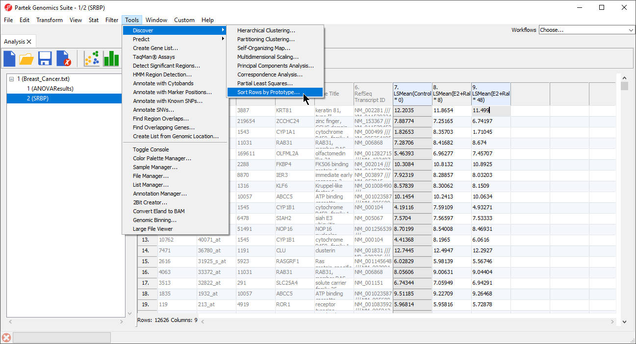
We can now invoke Sort rows by prototype on the modified spreadsheet.
- Select Tools from the main toolbar
- Select Discovery
- Select Sort Rows by Prototype... (Figure 2)
| Numbered figure captions | ||||
|---|---|---|---|---|
| ||||
|
The Sort Rows by Prototype dialog will launch (Figure 3).
| Numbered figure captions | ||||
|---|---|---|---|---|
| ||||
|

The Pattern Type options (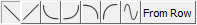 ) allow preset shapes to be applied to the prototype within the range specified by the Begin, End, Min, and Max parameters. The final option From Row allows you to select any row number in the spreadsheet to serve as the prototype. This is a useful option if you have a particular gene of interest and want to find other genes with similar expression profiles in your data set. You can also manually configure the prototype by dragging the points.
The Select Dissimilarity Measure drop-down menu allows to select from a wide variety of parametric and non-parametric measures of dissimilarity.
- After configuring the prototype and selecting a dissimilarity measure, select Sort to run the function
- Select Cancel to close the dialog
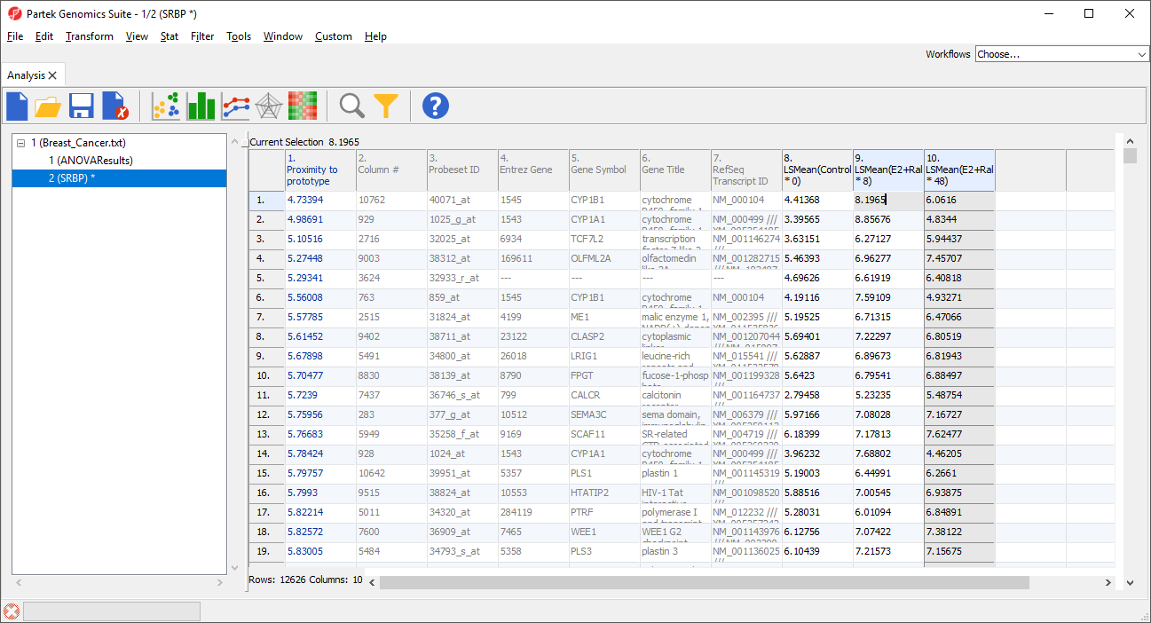
A new column 1 will be added to the spreadsheet and the rows will be reordered (Figure 4). The new column contains the dissimilarity score for each row; the lower the value, the more similar the row is to the prototype. The row with the highest similarity to the prototype is listed first, with the other rows listed in descending similarity to the prototype.
| Numbered figure captions | ||||
|---|---|---|---|---|
| ||||
|
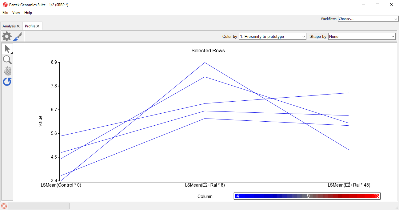
To view the results, we can generate a profile plot of several of the rows. For example, here we will show the top five most similar probe(sets)/genes.
- Select the row headers of the top 5 rows by selecting each while holding the Ctrl key or selecting the first and fifth while holding the Shift key
- Select View from the main toolbar
- Select Profiles
- Select Row Profiles
- Select Select for both Plots and X-Axis in the Configure Data Source dialog
The profile plot will open as a new tab (Figure 5).
| Numbered figure captions | ||||
|---|---|---|---|---|
| ||||
|
| Additional assistance |
|---|
|
| Rate Macro | ||
|---|---|---|
|
Overview
Content Tools