Join us for an event September 26!
How to Streamline RNA-Seq analysis and increase productivity—point, click, and done
Page History
...
Partek Genomics Suite offers two alternatives to Hierarchical clustering - K-Means clustering and Self-Organizing Map. For a more in-depth description of how Partek Genomics Suite performs these different forms of clustering analysis, please see Chapter 8 Hierarchical & Partitioning Clustering of the Partek Manual. The Partek Manual can be accessed through Partek Genomics Suite under Help > On-Line Help.
Visualizing Hierarchical Clustering
...
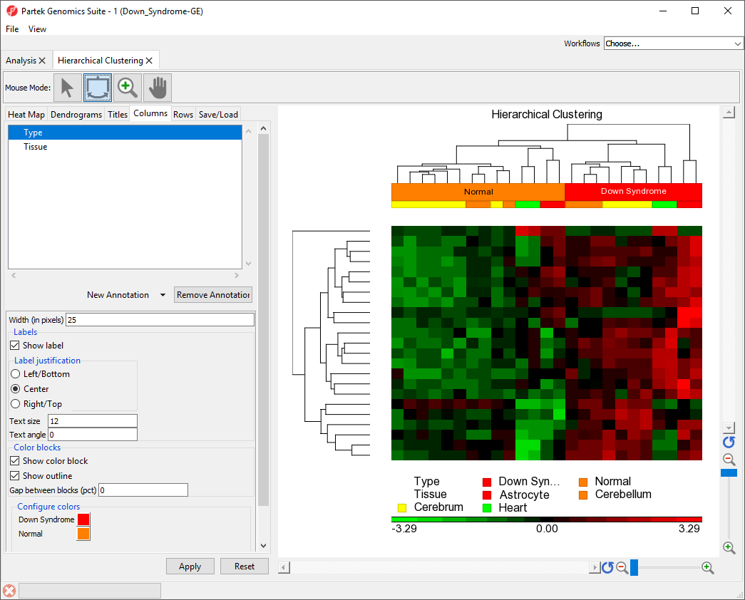
To illustrate the capabilities and customization options of hierarchical clustering in Partek Genomics Suite, we will explore an example of hierarchical clustering drawn from the tutorial Gene Expression Analysis. The data set in this tutorial includes gene expression data from patients with or without Down syndrome. Using this data set, 23 highly differentially expressed genes between Down syndrome and normal patient tissues were identified. These 23 differentially regulated genes were then used to perform hierarchical clustering of the samples. Follow the steps outlined in Hierarchical Clustering and Adding Information to Gene Lists to perform hierarchical clustering and launch the Hierarchical Clustering tab (Figure 1).
| Numbered figure captions | ||||
|---|---|---|---|---|
| ||||
|
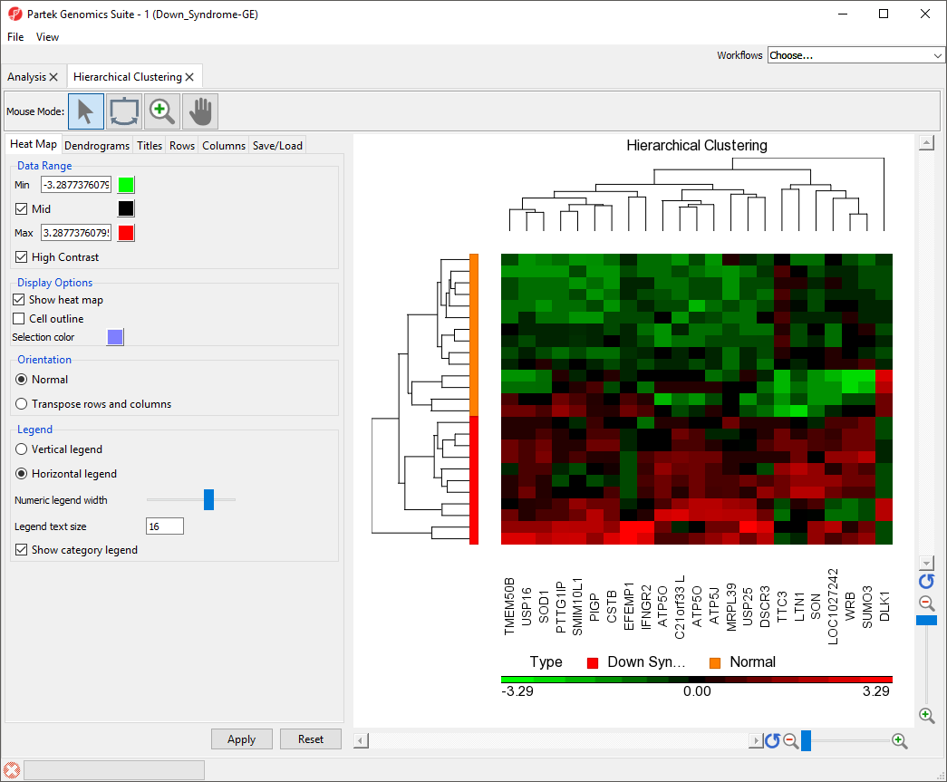
The right-hand section of the Hierarchical Clustering tab is a heatmap heat map showing relative expression of the genes in the list used to perform clustering. The heatmap heat map can be configured using the properties panel on the left-hand side of the tab. By default, down-regulated genes will be shown in green, genes with no change in expression will be shown in black, and up-regulated genes will be shown in red.The dendograms on the left-hand side and top of the heatmap show heat map show clustering of samples as rows and features (probes/genes in this example) as columns. Columns are labeled with the gene symbol if there is enough space for every gene to be annotated. Rows are colored based on the groups of the first sample categorical attribute in the source spreadsheet. The sample legend below the heat map indicates which colors correspond to which attribute group. In this example, Down syndrome patient samples are red and normal patient samples are orange.
The heat map can be configured using the properties panel on the left-hand side of the Hierarchical clustering tab.
Configuring the Hierarchical Clustering Plot
| Table of Contents | ||||
|---|---|---|---|---|
|
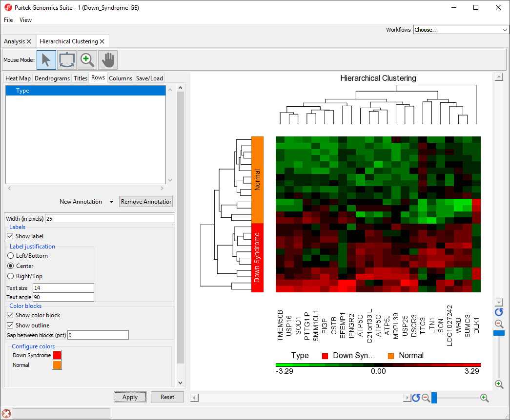
Labeling Sample Groups in the Heat Map
- Select the Rows tab
- Verify that Type appears in the annotation box
- Set Width (in pixels) to 25
This will increase the width of the color box indicating sample Type.
- Select Show Label
- Set Text size to 12
- Set Text angle to 90
This angle is relative to the x-axis. When set to 90, the text will run along the y-axis.
- Select Apply
The sample attributes are now labeled with group titles (Figure 2).
| Numbered figure captions | ||||
|---|---|---|---|---|
| ||||
|
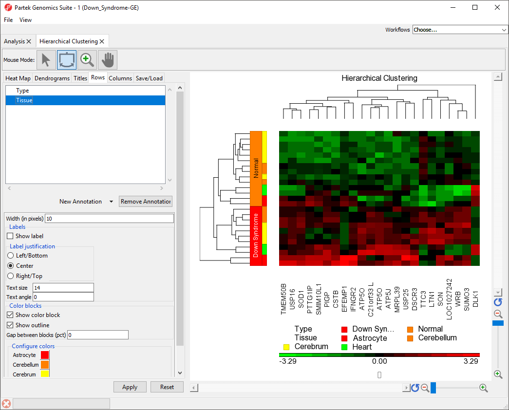
Adding a Sample Attribute to the Heat Map
- Select the Rows tab
- Select Tissue from the New Annotation drop-down menu
- Select Apply
Color blocks indicating the tissue of each sample have been added to the row labels and sample legend (Figure 3).
| Numbered figure captions | ||||
|---|---|---|---|---|
| ||||
|
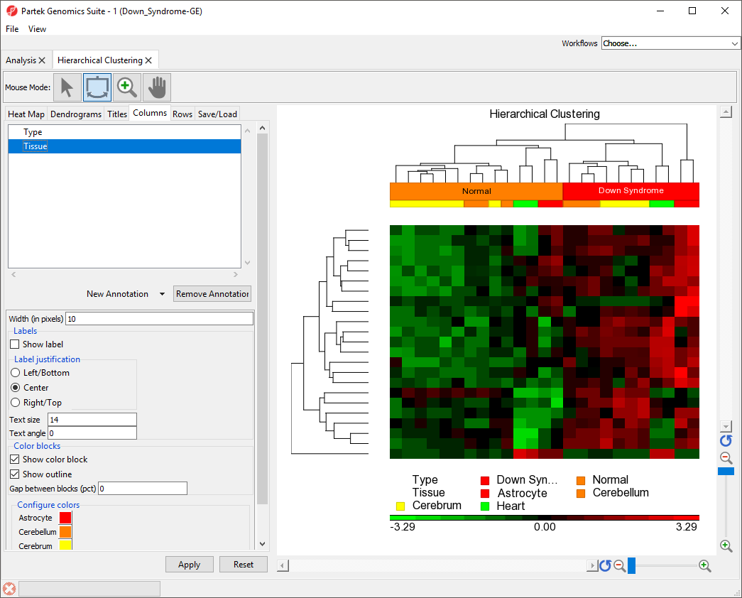
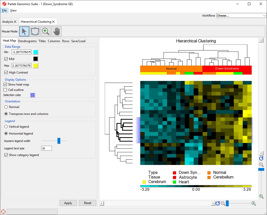
Changing the Orientation of the Rows and Columns
By default, Partek Genomics Suite displays samples on rows and features on columns. We can transpose the heat map using the Heat Map tab in the plot properties panel.
- Select the Heat Map tab
- Select Transpose rows and columns in the Orientation section
- Select Apply
The plot has been transposed with samples on columns and features on rows. The label for the sample groups is now in the vertical orientation because the settings we applied to Rows has been applied to Columns.
- Select the Columns tab
- Select the Type track
- Set Text angle to 0
- Select Apply
The sample group label for Type is now visible (Figure 4).
| Numbered figure captions | ||||
|---|---|---|---|---|
| ||||
|
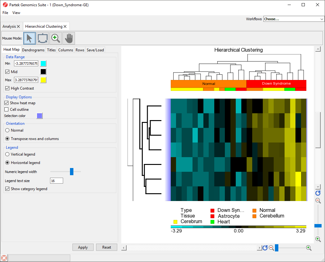
Flipping Columns or Rows
Any of the denograms legs can be flipped to reorient the cluster. This does not change the clustering, only the position of the clusters on the plot.
- Select (
 ) from the Mouse Mode icon set to activate Flip Mode
 - Click on the dendogram leg associated with the bottom row
The bottom row has moved to the top of the heat map (Figure 5).
| Numbered figure captions | ||||
|---|---|---|---|---|
| ||||
|
Changing Heat Map Colors
The minimum, maximum, and midpoint colors of the heart map intensity plot can be customized.
- Select the Heat Map tab
- Set Min color to (
 ) using the color picker tool
 - Set Max color to (
 ) using the color picker tool
 - Select Apply
The heat map and plot intensity legend now show maximum values in yellow and minimum values in light blue with a black midpoint (Figure 6). The data range can also be customized by changing the values of Min and Max.
| Numbered figure captions | ||||
|---|---|---|---|---|
| ||||
|

Zooming to Selected Rows/Columns
We can use the hierarchical clustering heat map to examine groups of genes that exhibit similar expression patterns. For example, genes that are up-regulated in Downs syndrome samples and down-regulated in normal samples.
- Select (
 ) from the Mouse Mode icon set to activate Selection Mode
 - Select on the middle cluster of the rows denodgram as shown (Figure 7) to select it
The selected dendogram column will be in bold and the selected rows will be highlighted.
| Numbered figure captions | ||||
|---|---|---|---|---|
| ||||
|
- Right-click on the dendogram
- Select Zoom to Fit Selected Rows
The same steps can be used to zoom into columns or rows. Here, we have zoomed in on the rows, but not columns to show the expression levels of the selected genes for all samples (Figure 8).
| Numbered figure captions | ||||
|---|---|---|---|---|
| ||||
|
- Select (
 ) on the y-axis to show all rows
 - Click anywhere in the hierarchical clustering plot to deselect the dendogram
Exporting a List of Genes From a Selected Cluster
Partek Genomics Suite can export a list of genes from any cluster selected, allowing large gene sets to be filtered based on the results of hierarchical clustering.
- Select () from the Mouse Mode icon set to activate Selection Mode
- Select the bottom cluster of the rows dendogram (Figure 9)
| Numbered figure captions | ||||
|---|---|---|---|---|
| ||||
|
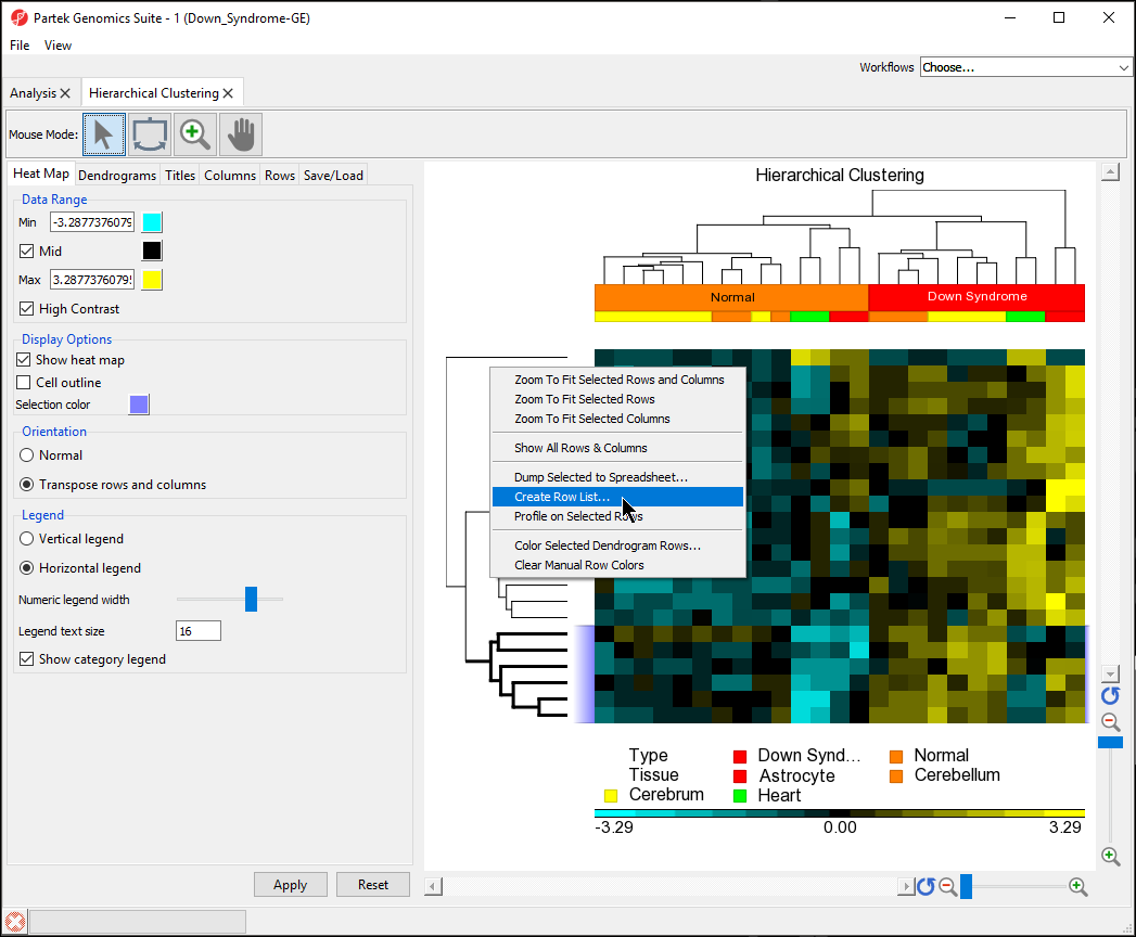
- Name the gene set Down in normal
- Select OK
- Save the list as down in normal
In the Analysis tab, there is now a spreadsheet row_list (down in normal.txt) containing the 6 genes that were in the selected cluster. The same steps can be used to create a list of samples form the hierarchical clustering by selecting clusters on the sample dendogram.
Exporting the Hierarchical Cluster Plot Image
Like very visualization in Partek Genomics Suite, the hierarchical clustering image can be exported as a publication quality image.
- Select the Hierarchical Clustering tab
- Select File from the main toolbar
- Select Save Image As... from the drop-down menu
- Select a destination and name for the file
- Select PNG or your preferred image type from the pull-down menu
- Select Save
| Numbered figure captions | ||||
|---|---|---|---|---|
| ||||
|
| Additional assistance |
|---|
|
| Rate Macro | ||
|---|---|---|
|
Overview
Content Tools